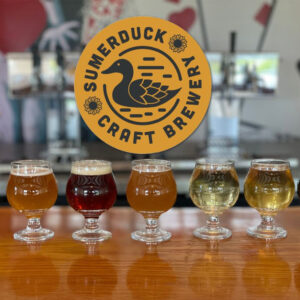
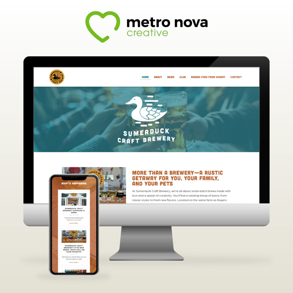
At Sumerduck Craft Brewery, the experience of enjoying expertly crafted beers goes hand in hand with a strong brand identity. Nestled on the scenic grounds of Rogers Ford Farm Winery, this small-batch brewery needed a visual presence that reflected its creativity, community spirit, and rustic charm. We were excited to partner with them to design their logo, brand identity, and website. Here’s a closer look at our design process and the thought that went into each element.
Understanding the Vision
The journey began with a deep dive into Sumerduck’s mission and values. We aimed to capture the essence of a brewery that prides itself on handcrafting unique beers for its community. Our goal was to create a brand identity that resonated with their target audience—beer lovers who appreciate quality and a welcoming atmosphere.
Logo Design: Playful Yet Contemporary
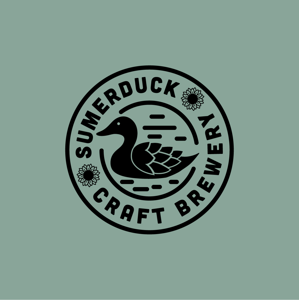
The logo is the cornerstone of any brand identity, and for Sumerduck, we wanted it to reflect both playfulness and sophistication. Drawing inspiration from the concept of handcrafted beers, we introduced a duck icon that embodies the brewery’s lighthearted spirit. The design strikes a balance between whimsical and modern, appealing to a broad audience. An interesting design choice was to position the font slightly off-center. This deliberate asymmetry adds a touch of dynamism and energy, mirroring the easy-going nature of a duck floating on water. The logo invites patrons to relax and enjoy their experience, setting the tone for what Sumerduck represents.
Color Palette: Reflecting Nature
Color plays a crucial role in brand perception. For Sumerduck, we selected a palette of warm amber tones paired with rich blues. Green serves as the dominant hue, symbolizing growth, renewal, and the vibrant spirit of the brewery. This combination infuses the brand with vitality, aligning perfectly with Sumerduck’s commitment to crafting fresh, high-quality beers.
Font Choice: Modern and Inviting
To complement the playful logo, we chose the soft-edged sans serif font ‘Cubano.’ Its rounded corners create a sense of approachability, making the brand feel welcoming. This choice was intentional, reflecting the brewery’s friendly atmosphere where everyone—from families to pet owners—can feel at home.
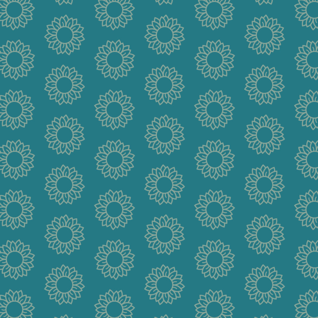
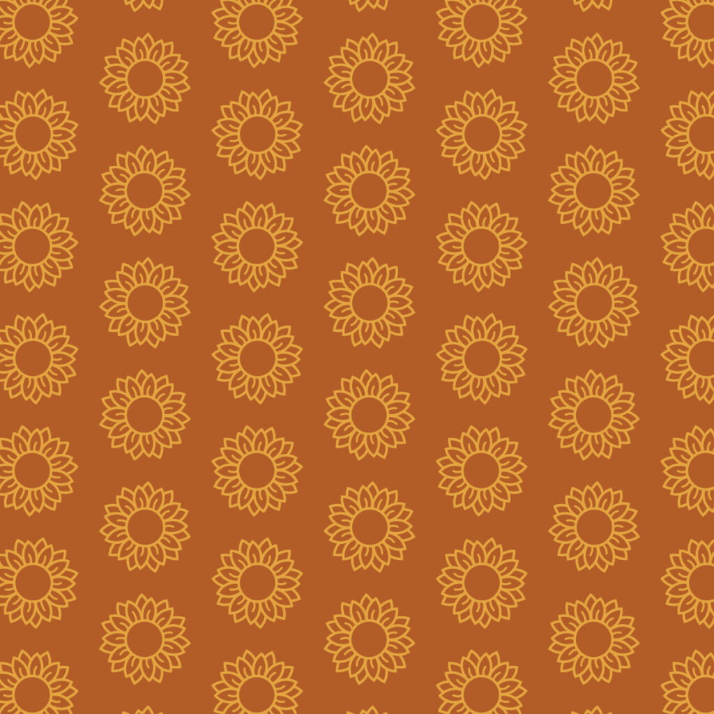
Pattern Design: Building Recognition
To enhance brand consistency, we developed a pattern using the Sumerduck Craft Brewery flower icon. This pattern serves as a visual signature, enhancing packaging and promotional materials. By establishing this recognizable element, we ensure that the brand is easily identifiable, making a lasting impression on visitors.
Website Design: A Seamless User Experience
The website was designed to be an extension of Sumerduck’s warm and inviting atmosphere. We focused on creating an intuitive layout that allows visitors to explore the brewery’s offerings effortlessly. Featuring vibrant imagery and engaging content, the site not only showcases their rotating lineup of beers but also highlights upcoming events and the brewing process. By incorporating the brand’s visual identity throughout the website, we created a cohesive online presence that reflects the rustic charm of the taphouse. The site encourages community engagement and provides a platform for customers to connect with Sumerduck beyond their physical location.
In Conclusion
The design journey for Sumerduck Craft Brewery was rooted in a commitment to capturing their essence and vision. From the playful logo to the thoughtfully curated color palette and inviting website, every design element works harmoniously to create a brand that resonates with its audience. As Sumerduck continues to brew innovative beers and foster community connections, we’re proud to have contributed to their story through a cohesive and engaging brand identity. Cheers to good beer and great design!