Who is PMR General Contracting?
PMR General Contracting is a company focused on transforming living spaces into luxurious sanctuaries. Their mission emphasizes attention to detail and exceptional customer care, crafting bespoke interiors that reflect each client’s unique vision and lifestyle. They prioritize quality, precision, and service, aiming to exceed expectations and create elegant, functional environments that inspire and delight.
The Project
At Metro Nova Creative, we had the exciting opportunity to design PMR’s logo and brand identity, as well as develop their website and various marketing materials, including business cards and car magnets. Our collaboration allowed us to capture the essence of PMR’s commitment to transforming living spaces into luxurious sanctuaries, ensuring that every design element reflected their dedication to quality and customer care. This comprehensive branding effort not only enhanced PMR’s visual identity but also helped convey their unique vision and exceptional service to clients.
The Logo Concept
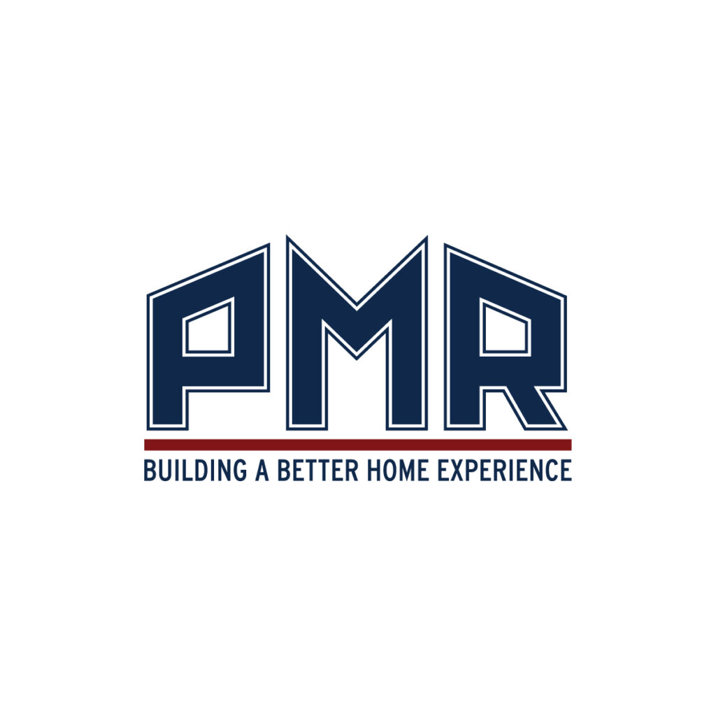
The logo we designed for PMR embodies strength and reliability, effectively capturing the essence of their brand. Utilizing bold, geometric shapes, the design conveys a sense of stability and professionalism, resonating with clients seeking quality and craftsmanship. The choice of a sans-serif font adds a modern touch, enhancing readability while maintaining a sleek aesthetic. Together, these elements create a powerful visual identity that reflects PMR’s commitment to transforming spaces with precision and care. This logo not only stands out in the competitive contracting industry but also instills confidence in potential clients, making it a memorable representation of their brand values.

Color Choice
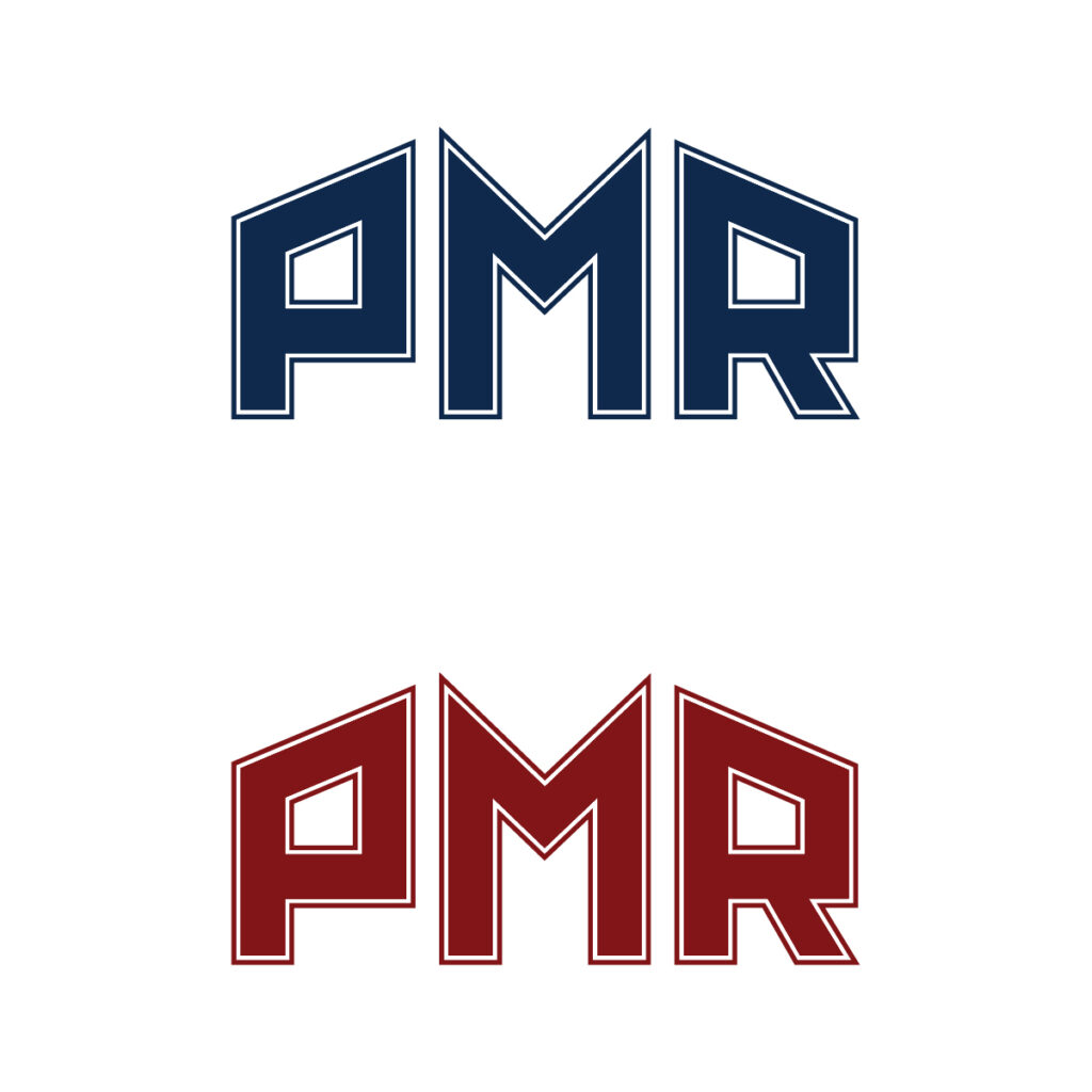
The brand identity’s color palette for PMR, featuring Dark Blue and Deep Red, has been carefully selected to reflect the essence of the company. Dark Blue conveys trust and reliability, symbolizing PMR’s commitment to quality craftsmanship. In contrast, Deep Red adds vitality and energy, representing passion and strength. Together, these colors create a cohesive and impactful identity that embodies progress and elegance, aligning perfectly with PMR’s mission to transform living spaces into luxurious sanctuaries.
Font Choice
A sans-serif font is an ideal choice for a construction company, embodying a bold, clean, and modern aesthetic. Its strong lines exude reliability and professionalism, making it particularly effective for on-site signage. This style not only enhances legibility but also conveys a sense of confidence and stability, perfectly aligning with the values of a reputable contracting firm.
Website
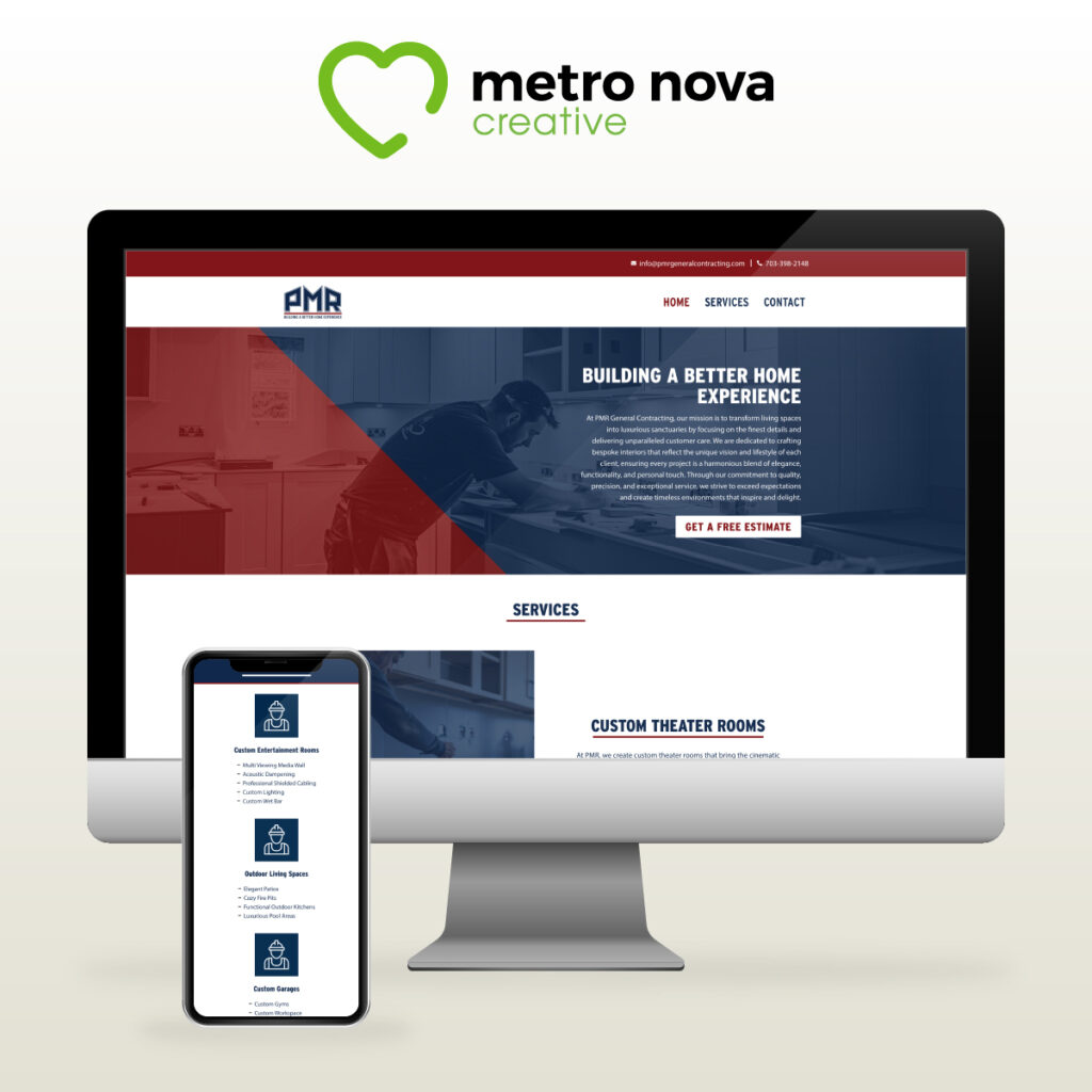
The website design for PMR is a seamless blend of aesthetics and functionality, designed to reflect the company’s commitment to quality and excellence. With a clean layout and intuitive navigation, the site enhances user experience, allowing visitors to easily explore PMR’s services and portfolio.
The use of high-quality imagery showcases completed projects, capturing the luxurious and bespoke nature of their work. Strategic placement of calls-to-action encourages potential clients to engage, whether through consultations or inquiries.
The color palette aligns with the brand identity, reinforcing the professionalism and vitality of PMR. Overall, the website serves not only as a digital storefront but also as a powerful marketing tool that communicates the company’s values and vision, inviting users to transform their living spaces with PMR’s expertise.
Comprehensive Marketing Materials
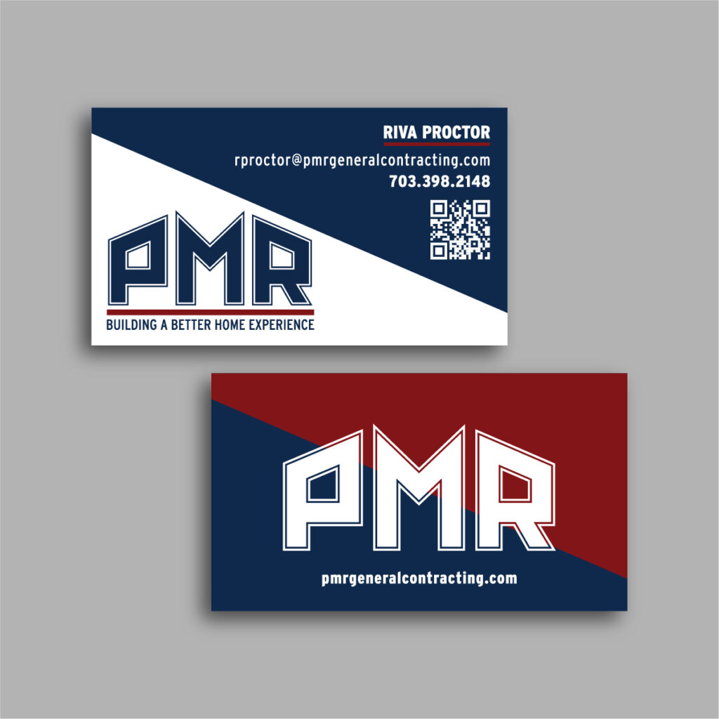
The business cards and truck magnets designed for PMR are essential tools for enhancing brand visibility and making a lasting impression. The business cards feature a sleek layout that highlights PMR’s logo and contact information, using the brand’s color palette to create a cohesive look. This design ensures that the cards are not only eye-catching but also reflective of PMR’s professionalism and attention to detail.
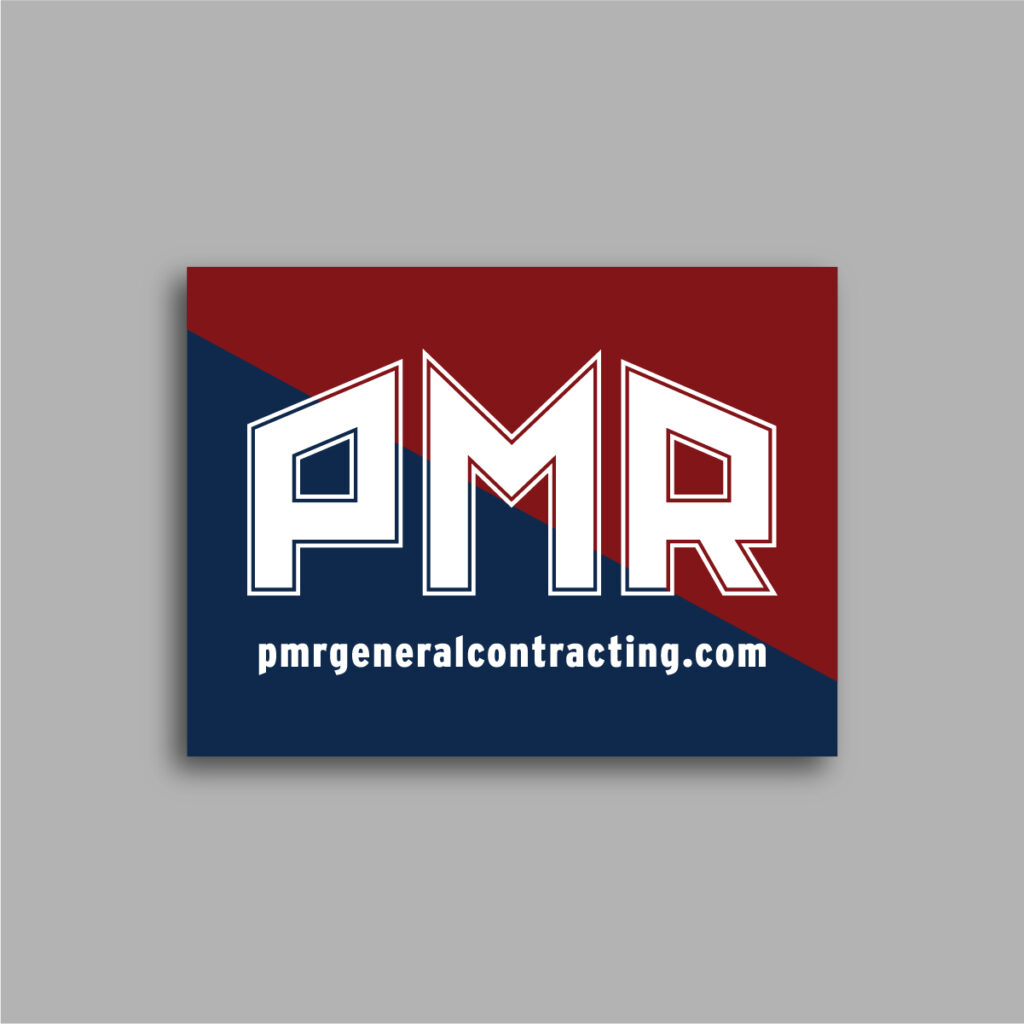
Similarly, the truck magnets serve as mobile advertisements, effectively promoting PMR’s services wherever they go. The bold colors and clear typography make the magnets easily readable from a distance, ensuring that potential clients can quickly identify the brand. By incorporating striking visuals and essential information, both the business cards and truck magnets reinforce PMR’s identity and commitment to excellence, helping to establish brand recognition in the community.
In Conclusion
In conclusion, the comprehensive branding efforts for PMR, including the logo, website design, business cards, and truck magnets, work harmoniously to create a strong and memorable identity. Each element reflects the company’s dedication to quality, professionalism, and customer care, ensuring that PMR stands out in the competitive construction industry. By effectively conveying their mission to transform living spaces into luxurious sanctuaries, these branding components not only attract potential clients but also inspire trust and confidence. Ultimately, this cohesive approach positions PMR as a leader in their field, ready to exceed expectations and deliver exceptional results.


