Case Study: Healing Through Design — A Kintsugi-Inspired Brand Identity for Nova EMDR
At Metro Nova Creative, we believe great branding goes far beyond visuals—it tells a story, evokes emotion, and connects people to purpose. That’s why our partnership with Nova EMDR, a virtual therapy practice focused on EMDR (Eye Movement Desensitization and Reprocessing), was so meaningful.
Our mission?
To design an identity, website, and client touchpoints that reflect healing, resilience, and compassion.
The Challenge: Building a Brand That Feels Like a Safe Place
Nova EMDR needed more than just a logo and a website—they needed a cohesive identity that embodied the values of trauma-informed care, mindfulness, and transformation.
Their therapy services are entirely virtual, so the brand had to carry the emotional weight of a welcoming office, a trusted presence, and a soothing environment—all through a screen. Every element needed to feel calming, intentional, and professional.
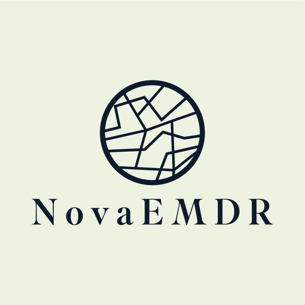
The Inspiration: Kintsugi as a Visual Metaphor for Healing
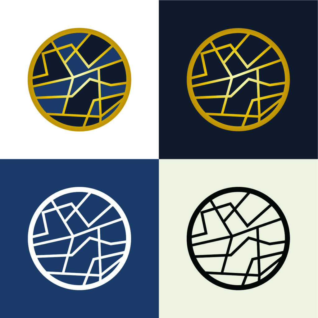
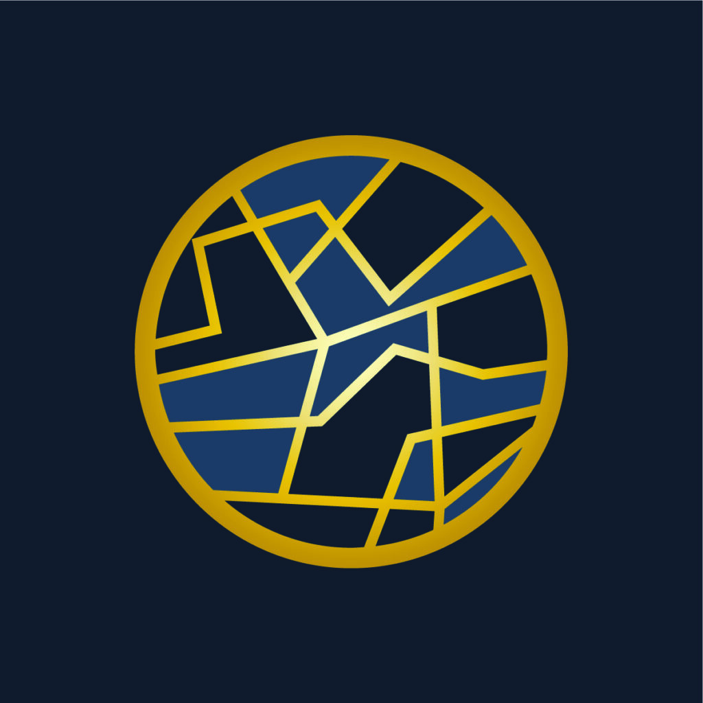
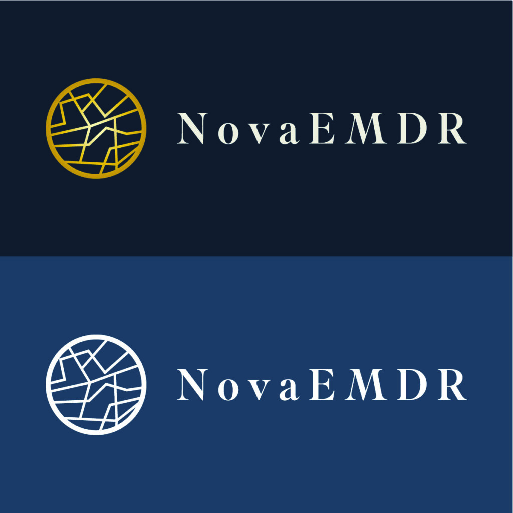
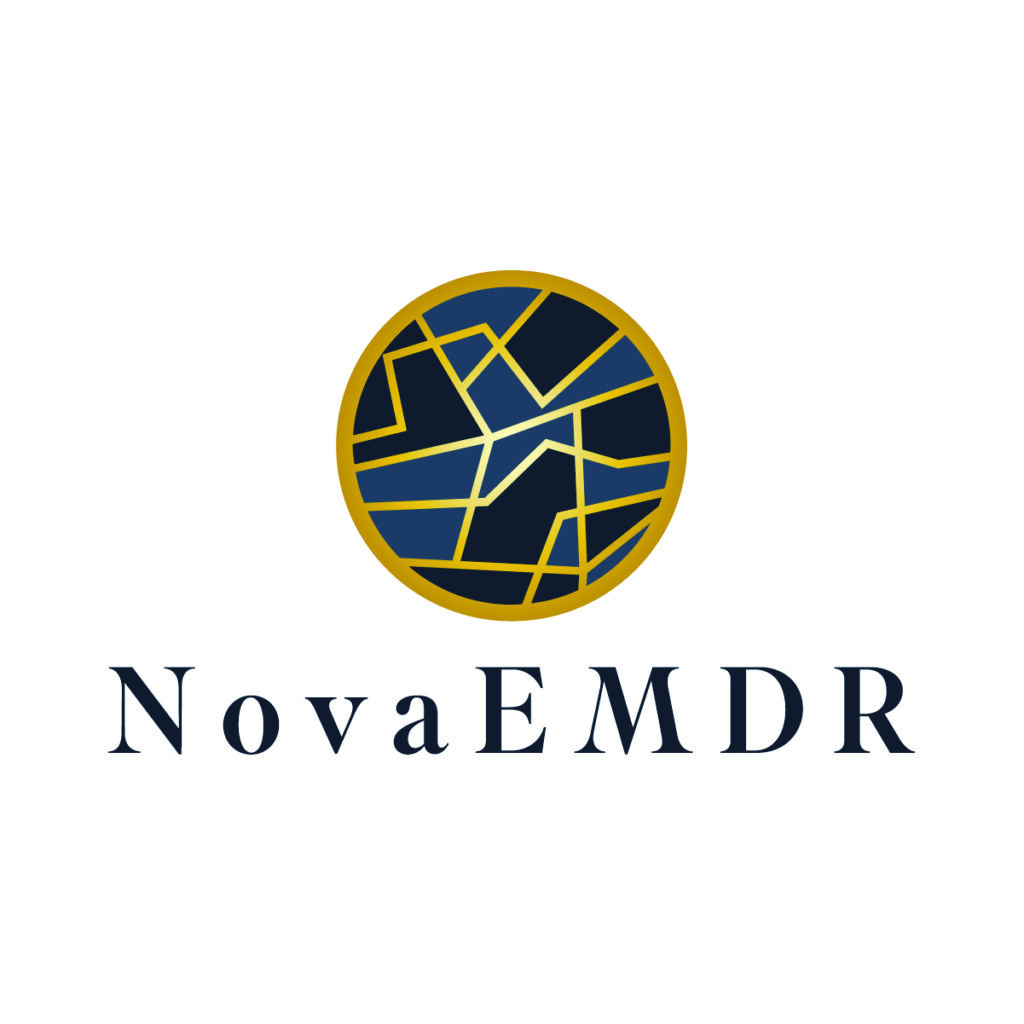
The heart of the brand lies in its Kintsugi-inspired logo.
Kintsugi is the centuries-old Japanese art of repairing broken pottery using gold lacquer. Rather than hiding flaws, it celebrates the cracks as part of the object’s story—making it more beautiful and unique than before.
We saw an immediate connection between Kintsugi and the therapy journey:
We are all a little broken. But with time, care, and intention—we can be repaired. And in that, there is beauty.
This philosophy became the foundation of the brand’s visual system.
Our Process: From Brand Story to Tangible Experience
🧠 Brand Identity Design
We crafted a logo that subtly mimics the visual rhythm of Kintsugi—fractured yet whole, with elegant line work suggesting gold repair through negative space. The color palette is soft and balanced, built on rich navy, warm ivory, and gold accents to evoke trust, calm, and strength.
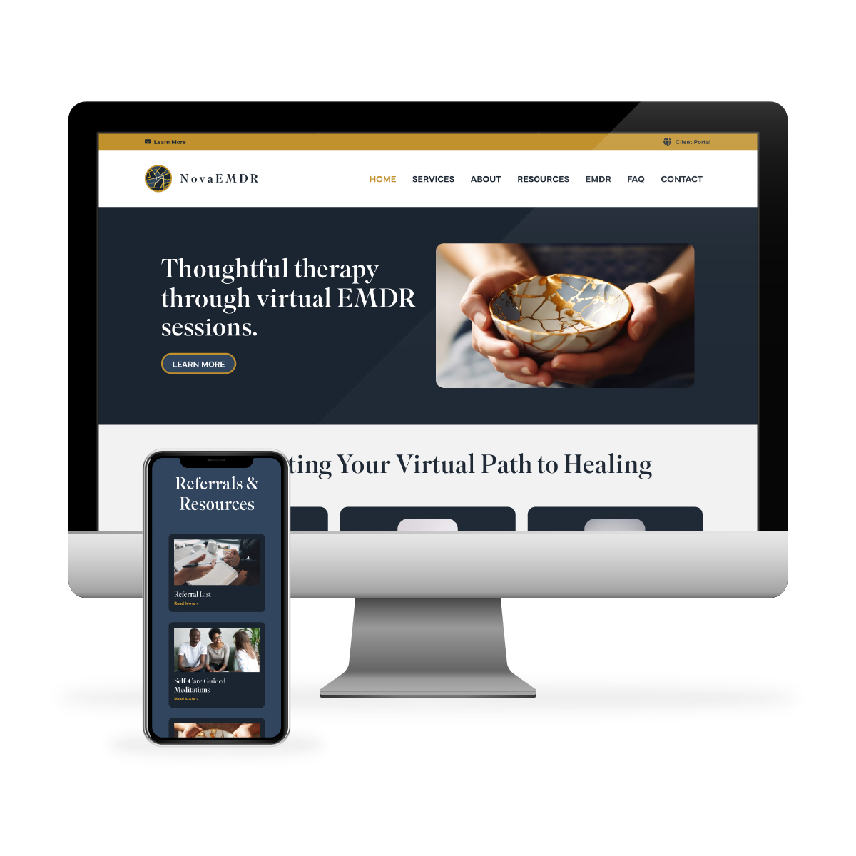
🌐 Website Design
The Nova EMDR website was designed to guide visitors with ease. We focused on:
- Clear, calming typography
- Mindful whitespace
- Easy-to-navigate service pages
- A strong call to action for virtual sessions
- Mobile optimization for accessibility
Everything was designed to reduce overwhelm for clients seeking support—removing friction and building trust through clarity.

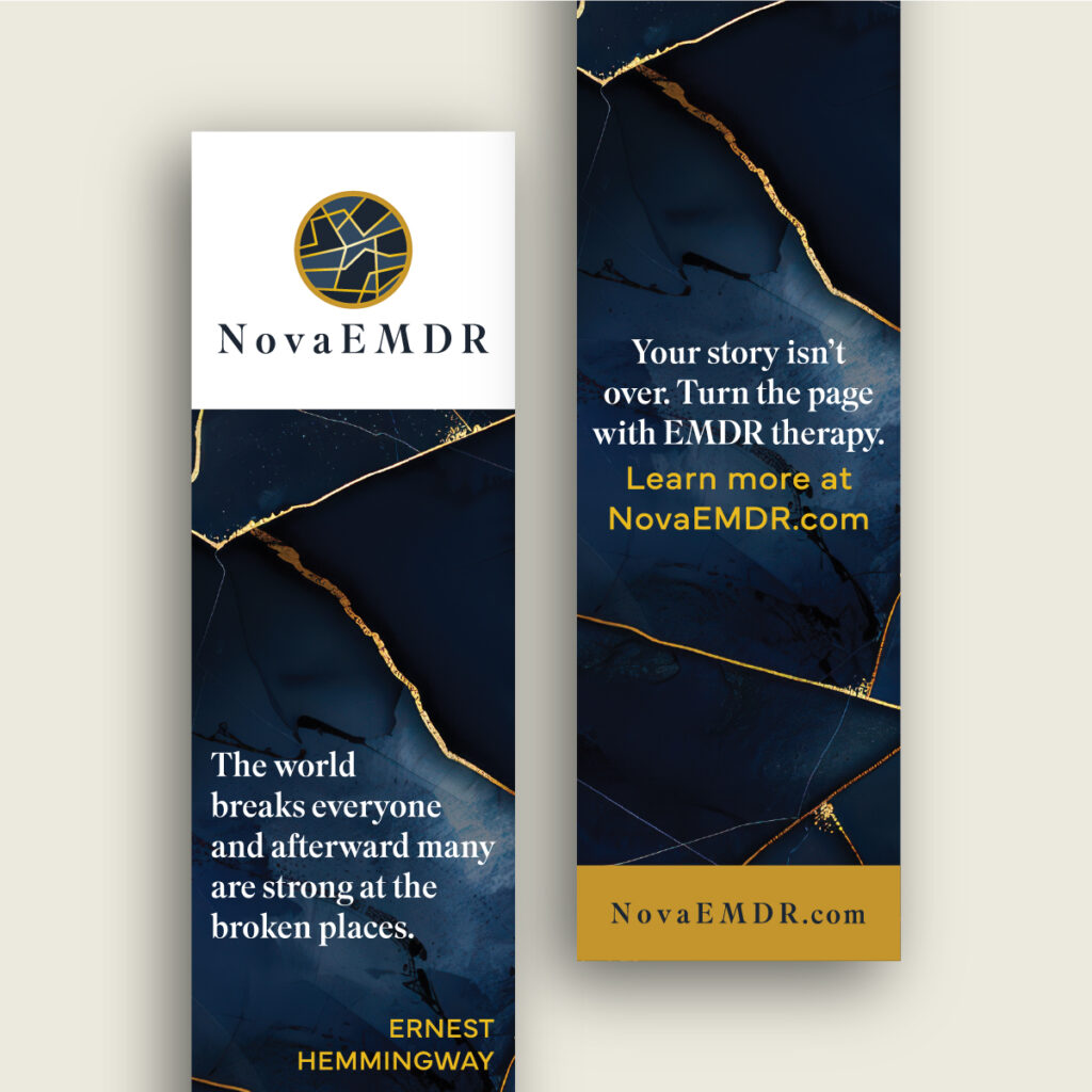
📚 Custom Bookmark Design
We also collaborated with Nova EMDR to create a custom-designed bookmark that would serve as a long-term touchpoint for clients.
These weren’t just handouts—they were keepsakes.
Each bookmark was printed on velvet-touch cardstock with spot gloss, creating a luxurious tactile experience. We selected this combination intentionally: the soft, almost suede-like texture inspires mindfulness, while the spot gloss accents highlight areas of gold as a nod to the Kintsugi theme.
These bookmarks weren’t only beautiful—they were designed to be part of a client’s healing ritual. A quiet reminder of strength and care.
The Result: A Brand That Heals, Honors, and Connects
Nova EMDR now has an identity system that’s more than a collection of colors and fonts—it’s a meaningful extension of their practice.
From the logo to the printed materials, from the first click to the final session, the brand offers:
- Emotional safety
- Visual harmony
- A sense of story and transformation
We’re proud to have partnered with a practice that sees design not as decoration, but as part of the healing process.
Closing Thoughts
Branding for therapy practices requires empathy, nuance, and care. With Nova EMDR, we were able to go deeper—infusing symbolism, psychology, and sensory design into every deliverable.
If your practice is looking for branding that reflects your mission and supports your clients’ journey, we’d love to help.