Property Management Company Branding
When Real Property Management Regions came to Metro Nova Creative, they weren’t just looking for a logo or marketing materials, they wanted to build a connection. The team wanted a brand that reflected their commitment to family, integrity, and helping property owners grow their wealth.
Our job was to help them tell that story.
Through brand strategy, creative identity work, and a new sub-brand campaign, we helped Real Property Management Regions transform their marketing into something deeply personal, and incredibly effective.
The Challenge: Turning Routine Property Management Into Meaningful Moments
As a trusted property management company, Real Property Management Regions already had a strong reputation for service. But the leadership team wanted more than that they wanted to inspire their property owners.
They asked us to help them:
- Strengthen their brand messaging
- Find ways to make their communication more personal and engaging
- Create something that reflected their family values and Puerto Rican heritage
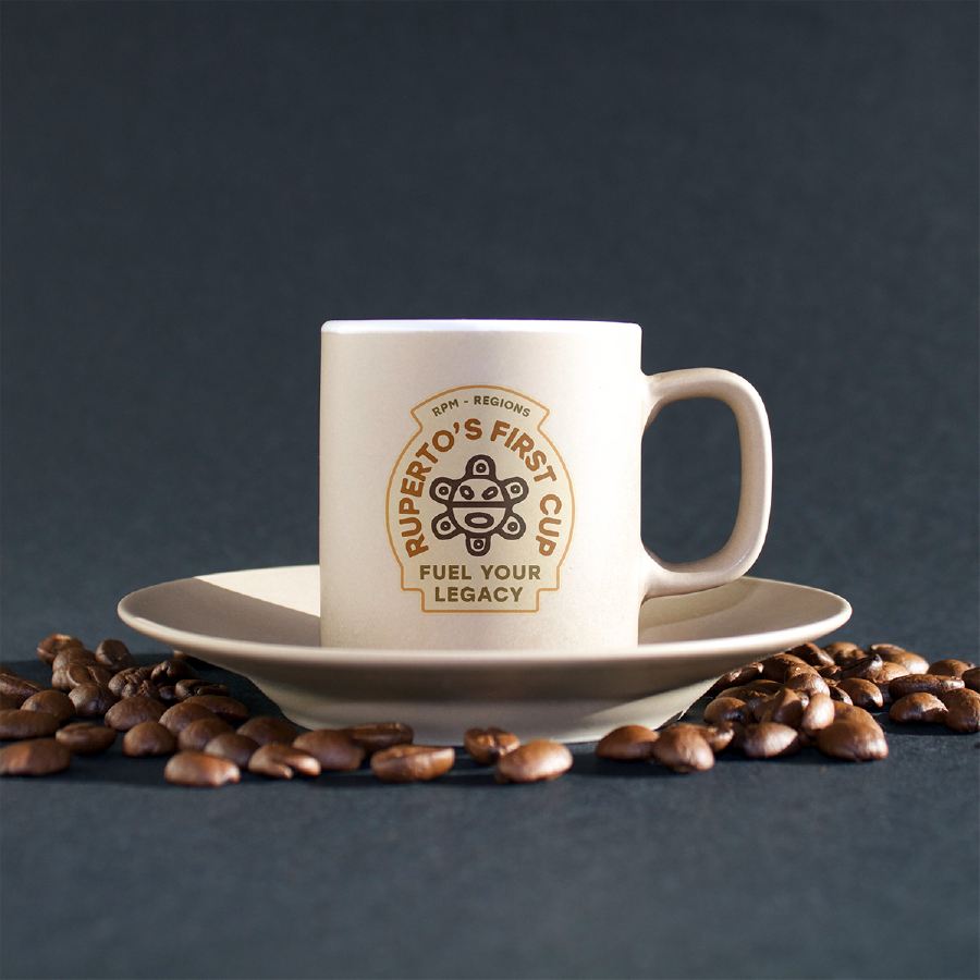
Our Solution: Ruperto’s First Cup — A Brand Built From the Heart
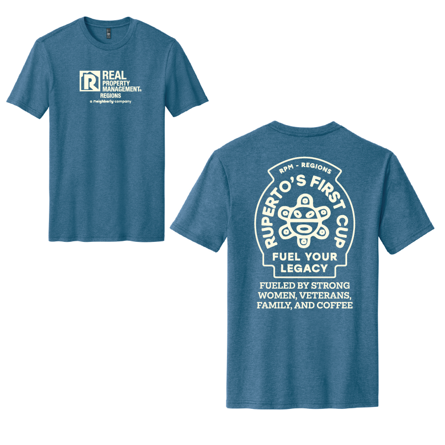
We started with brand strategy, understanding what made this client truly unique. That’s when we learned about Ruperto, the owner’s grandfather who worked on the coffee farms of Puerto Rico.
Coffee wasn’t just a drink to the family; it was part of their story. It represented hard work, community, and starting each day with purpose.
That story became the foundation for a new sub-brand campaign called Ruperto’s First Cup, a daily reminder to begin each morning with gratitude and inspiration.
Now, Real Property Management Regions sends a daily video message to their property owners, something uplifting to enjoy alongside their first cup of coffee. It’s a campaign that perfectly blends business with heart, building emotional connections that last.
The Visual Identity: Designing Ruperto’s First Cup
To bring the campaign to life, we designed a custom logo for Ruperto’s First Cup, a warm, coffee-inspired identity that ties back to the story’s roots.
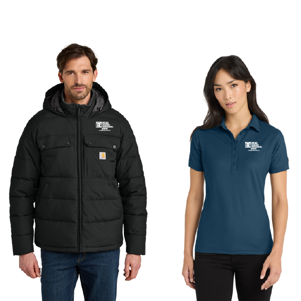
We also created and printed marketing materials that reflect the brand’s cozy, community-driven vibe:
- Branded shirts and tote bags
- Camping mugs for morning coffee
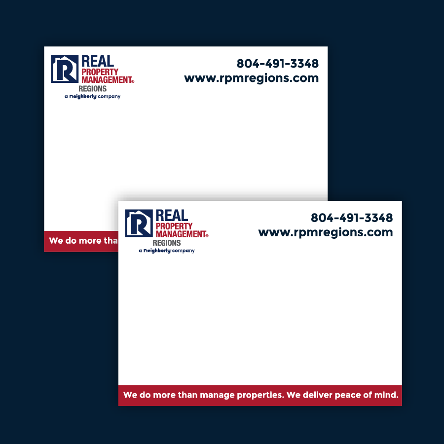
- Thoughtfully designed print collateral for both the sub-brand and main company

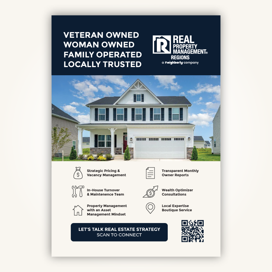
Marketing Collateral for Real Property Management Regions
Beyond the sub-brand, Metro Nova Creative also helped Real Property Management Regions elevate their overall marketing presence.
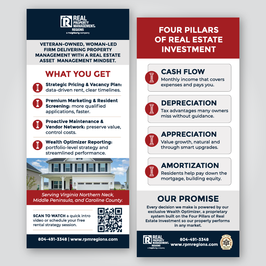
- Rack cards highlighting the 4 Pillars of Wealth
- Pop-up banners for events and presentations
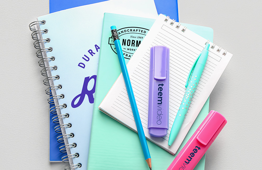
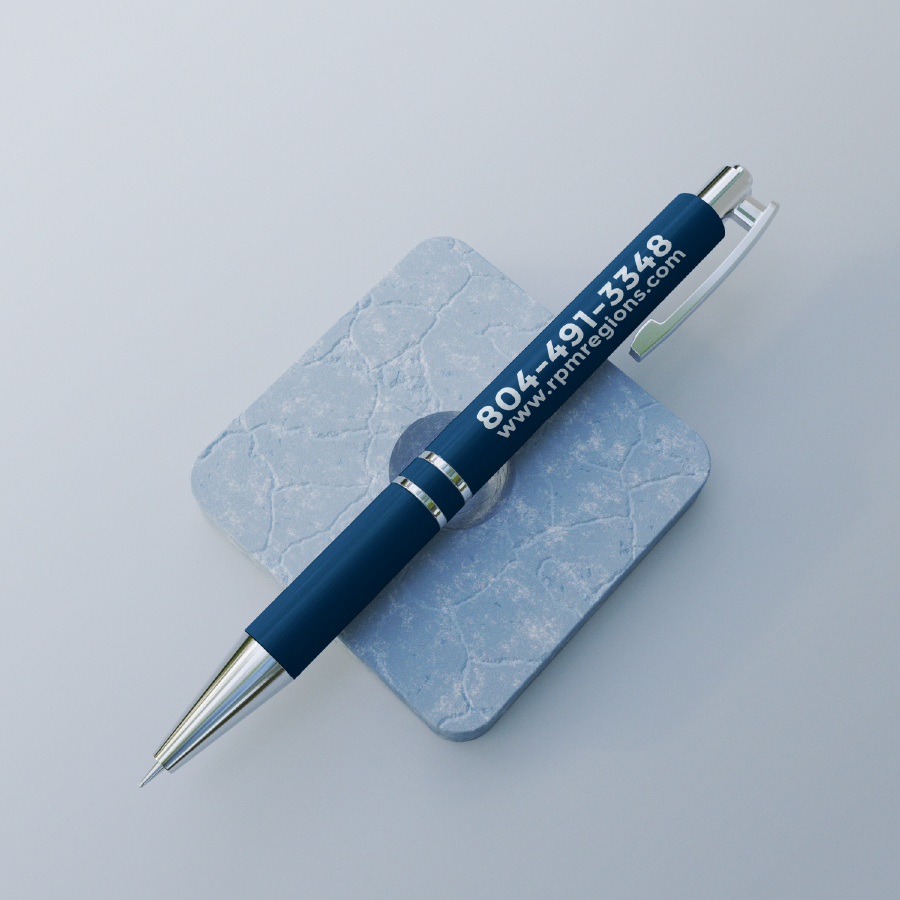
- Notepads and pens for day-to-day branding visibility
- Social media template kits

Collaboration Across Creative Partners
This project was a community effort. We love when our local creative network comes together to take care of a client:
- Sure Shot Screen Printing handled the Ruperto’s First Cup t-shirts and embroidered high-end garments for the team.
When local businesses collaborate, everyone wins and this project was a perfect example of that synergy.
The Result: A Brand That Inspires Connection Every Morning
Real Property Management Regions now has more than just marketing materials they have a story that connects.
Their Ruperto’s First Cup campaign has become a cornerstone of their client communication, creating authentic moments of inspiration that remind property owners why they trust the team at Real Property Management Regions.
From family roots to daily motivation, this project proved that great branding doesn’t just sell it builds community.