Case Study: Refreshing a Local Icon — Hyperion Espresso
Client: Hyperion Espresso
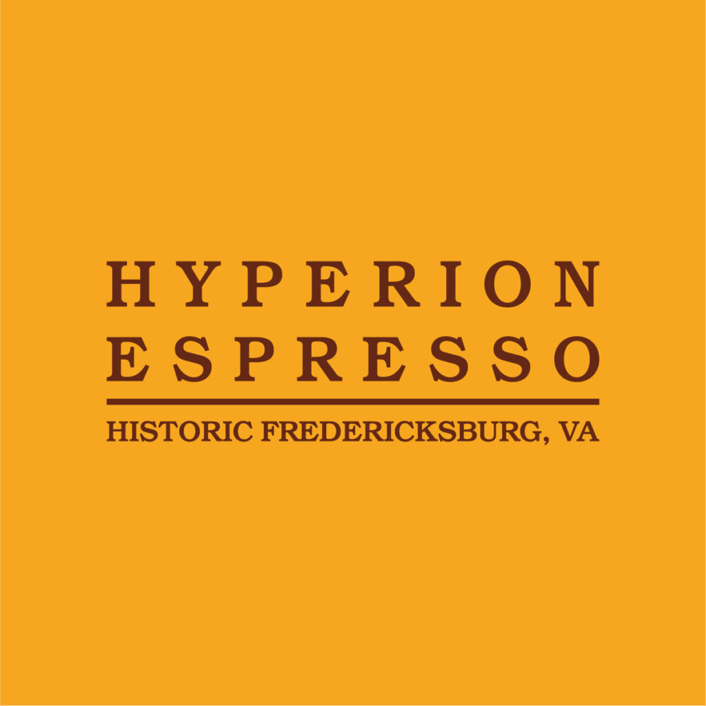
Location: Fredericksburg, VA
Services Provided: Brand Refresh, Logo Refinement, Brand Assets

The Challenge
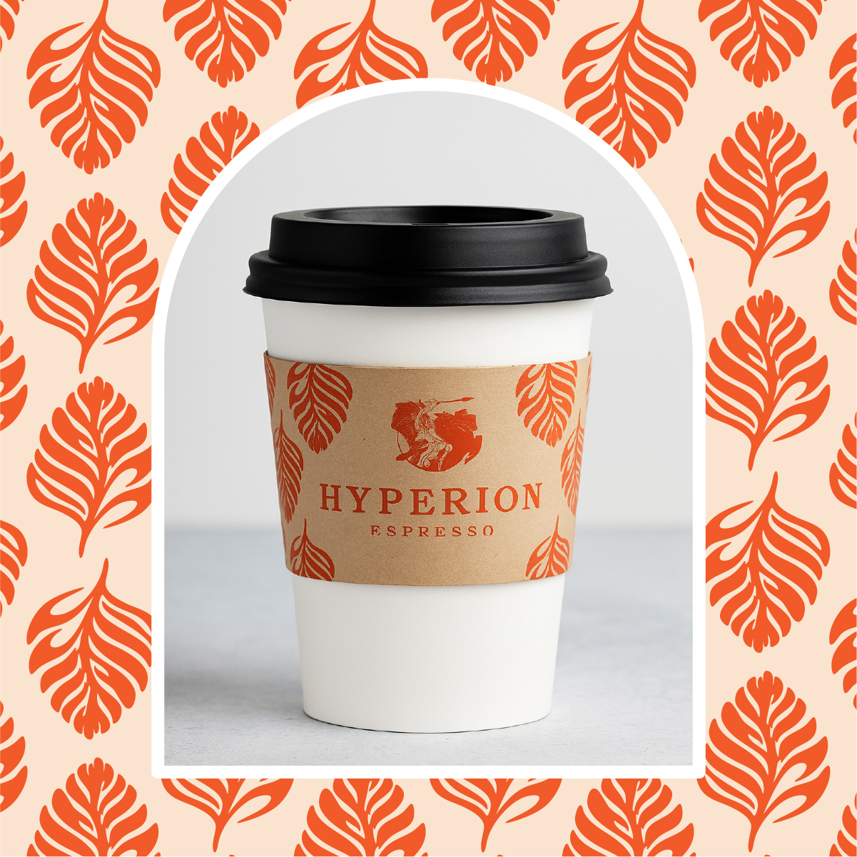
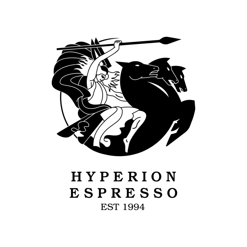
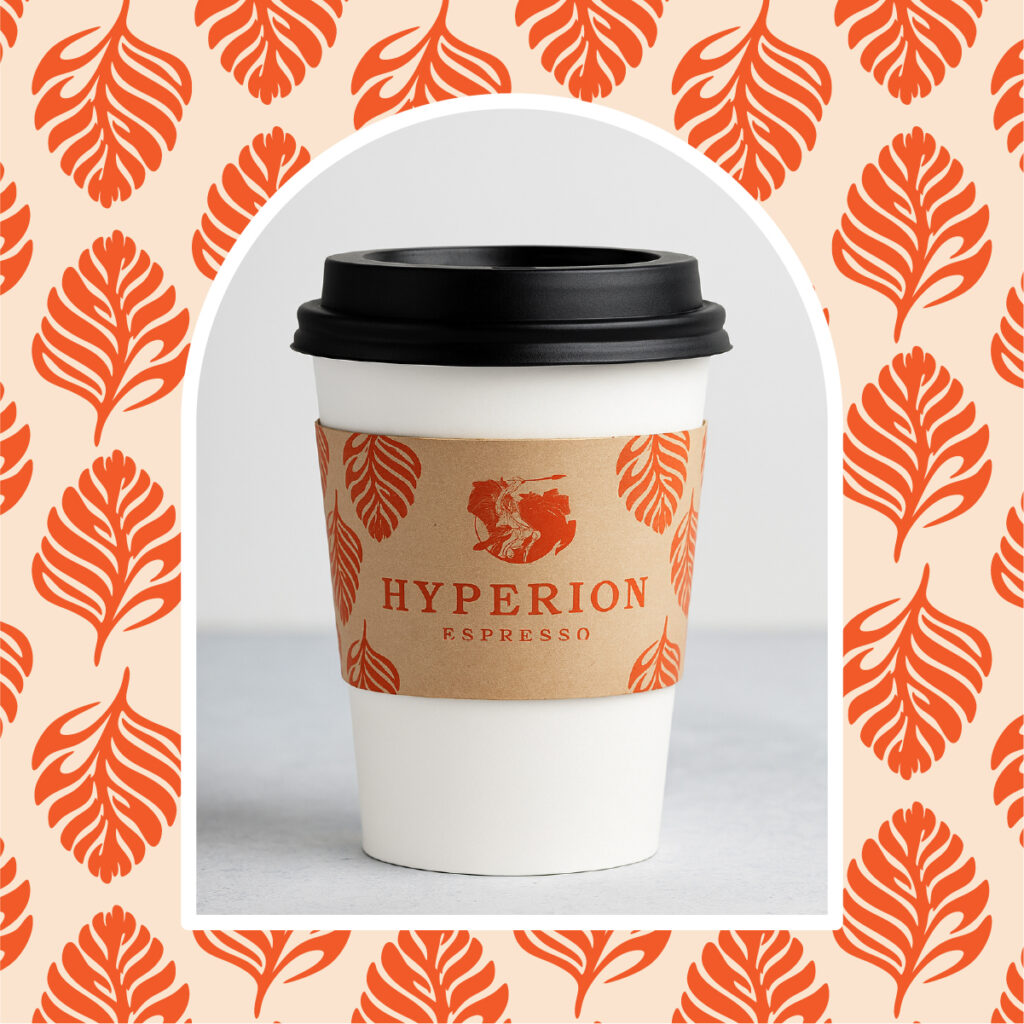
Since 1994, Hyperion Espresso has been a cornerstone of downtown Fredericksburg — a gathering place for coffee lovers, students, professionals, and neighbors alike. Their logo, steeped in classical inspiration and local recognition, has been a visual staple for decades.
But as with many historic brands, the original design wasn’t built with modern applications in mind. The intricate details that made the logo so striking also made it hard to reproduce at small sizes — whether on merchandise, embroidery, or digital platforms. Shrinking it down meant losing clarity, and in today’s world of icons and social media, that’s a big issue.
Hyperion needed a refresh — not a rebrand. This meant carefully balancing respect for their legacy with updates that would make their brand practical, scalable, and future-ready.
Our Approach
At Metro Nova Creative, we understood immediately that Hyperion’s logo wasn’t just an image — it’s a piece of Fredericksburg’s identity. Throwing it out and starting fresh wasn’t an option. Instead, we focused on a refinement process that would honor the history while solving the functional issues.
Our work included:
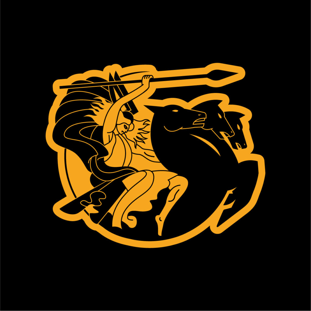
- Simplifying Line Work: We cleaned up the logo’s fine details, removing unnecessary visual clutter while keeping the iconic form intact.
- Scalability & Clarity: Adjustments ensured the logo now reproduces cleanly at both large and small sizes, including embroidery and digital avatars.
- Brand Colors: We introduced a refreshed core color palette that ties Hyperion Espresso to its parent company, creating a unified visual identity across the business family.
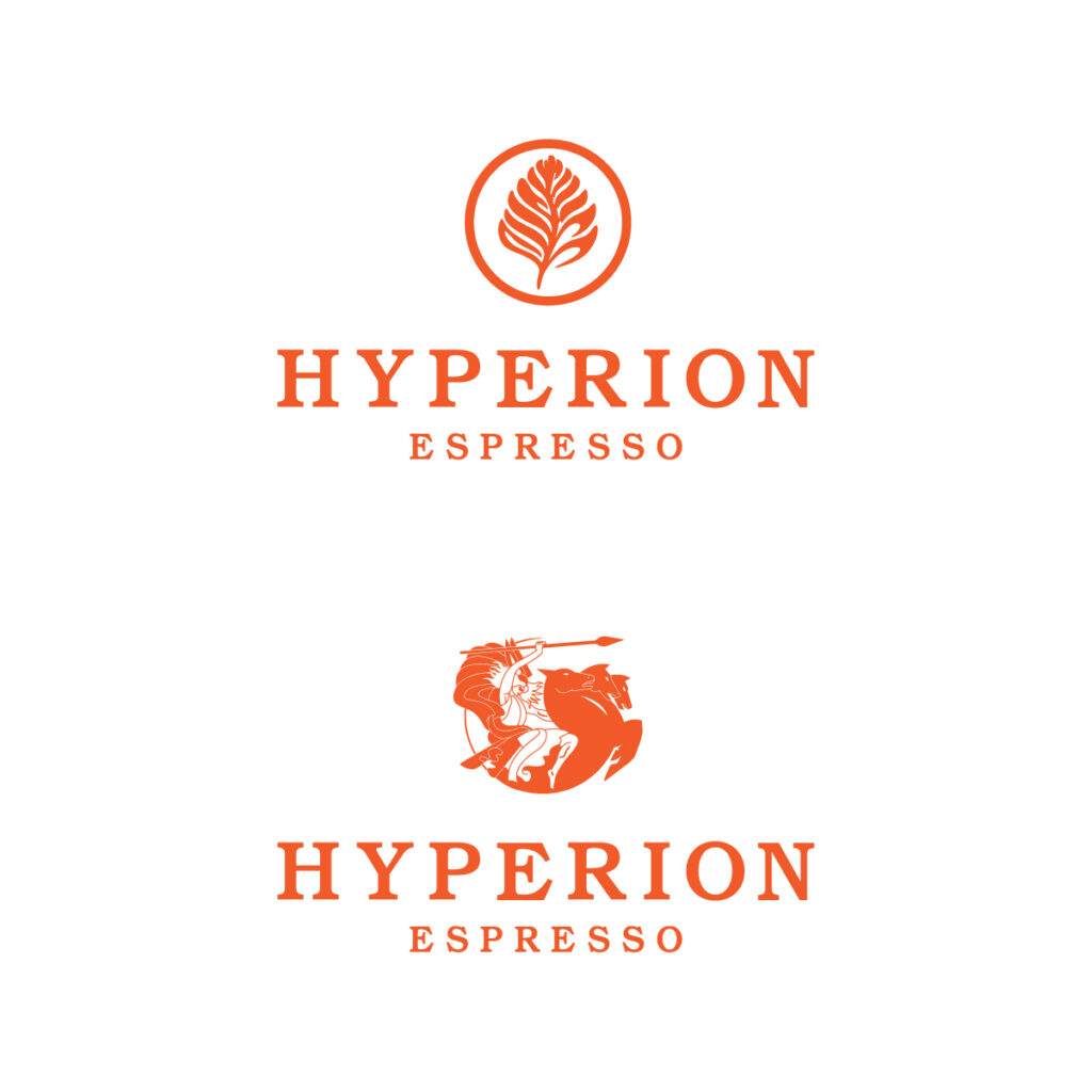
- Patterns & Alternatives: To give Hyperion more flexibility, we designed branded patterns and alternative logo marks (like icons and simplified versions) for use across print, packaging, and merchandise.
The Result
The result is a refined, modernized identity that feels every bit as historic and familiar as the original. Customers still see the Hyperion they know and love — but now the brand is more versatile, consistent, and ready to thrive in both digital and physical spaces.
Hyperion Espresso’s brand refresh stands as an example of how careful design can preserve legacy while preparing for the future. For a coffee shop that has been brewing community since 1994, that balance was essential.
👉 Looking to refresh your brand without losing its history? Metro Nova Creative can help you strike that balance.