In the dynamic world of branding and design, creating a memorable and versatile logo is paramount. At Metro Nova Creative, we adhere to a fundamental principle: a logo design must excel as a one-color piece, particularly in black. In this blog post, we’ll explore the rationale behind this approach and why it’s crucial for a logo to be both impactful and adaptable.
The Significance of a One-Color Logo:
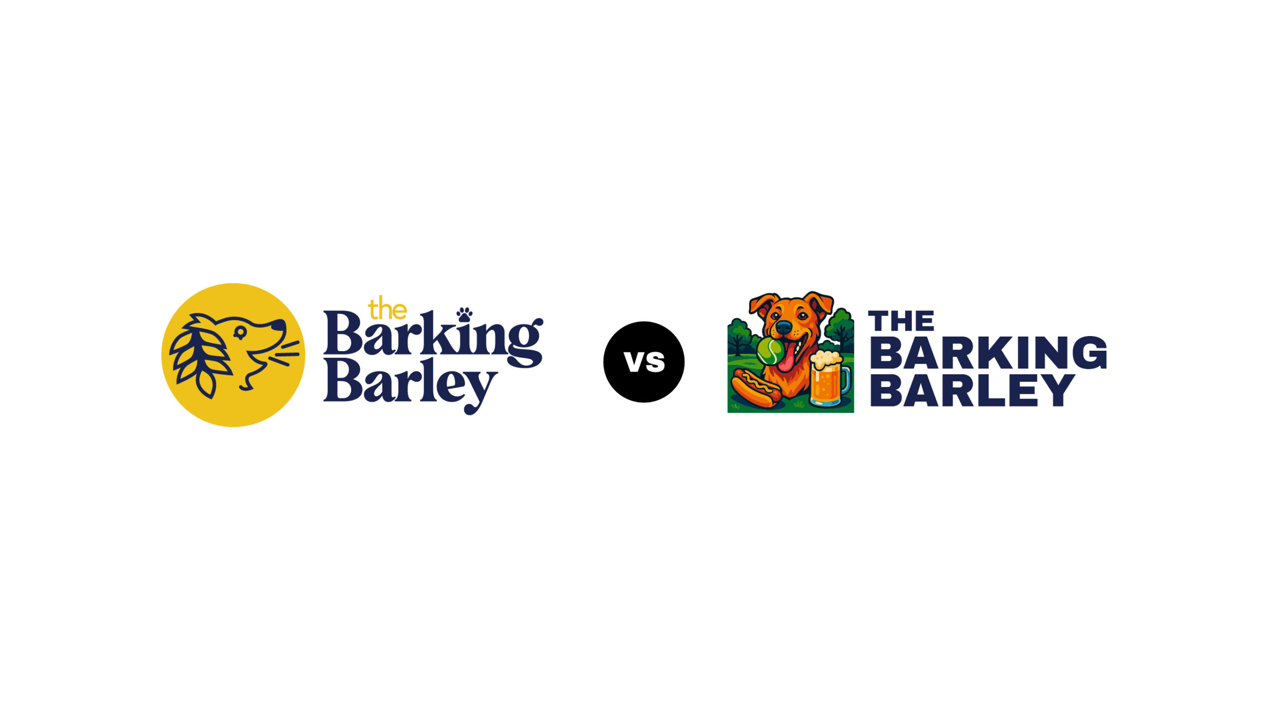
A one-color logo serves as a clear indicator of a company’s identity. It should evoke memories of interactions with the business and be easily identifiable. Here at MNC we believe that if a logo doesn’t work in a single color, it doesn’t work at all. This principle is grounded in practical considerations and contributes to a logo’s effectiveness across various applications.
Versatility in Printing and Cost-Effective Promotional Products:
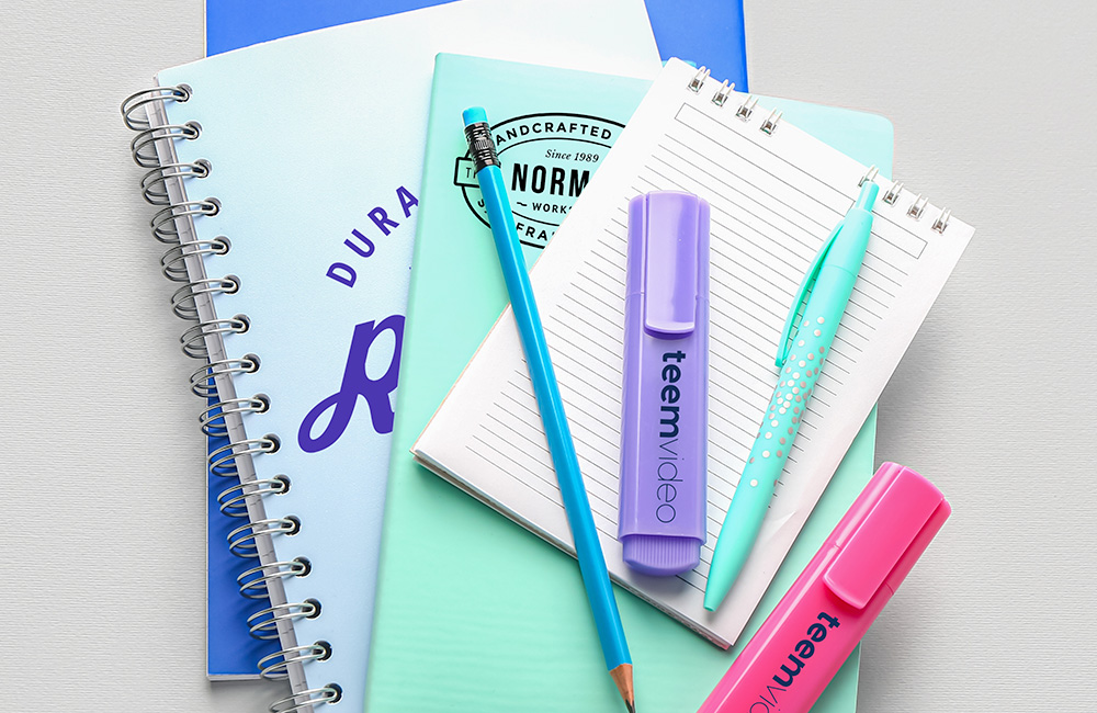
Designing a logo that works seamlessly in one color, especially in black, brings about practical advantages. Consider the scenario of printing the logo on merchandise like t-shirts. When opting for promotional products like plastic cups, the cost is often associated with the number of colors used. A one-color design simplifies the printing process and reduces costs, as you won’t need multiple inks for intricate color schemes. This not only saves money but also streamlines the production of branded items.
Metal Routing:
Another practical consideration is the use of the logo in metal routing. If your logo needs to be cut out of metal, a single-color design becomes imperative. Metal cutting processes typically limit the use of multiple colors, making a one-color logo essential for such applications. This foresight ensures that your logo maintains its integrity in diverse contexts.
Splash of Color, No Problem:
While emphasizing the importance of a one-color logo, it’s not about limiting creativity. It’s about ensuring a strong foundation. You can still have two or three color variations for full-color applications. These versions can be used strategically in different contexts, providing flexibility while maintaining the essence of your brand.
Closing Thoughts:
In the crazy world of logos, being bold doesn’t mean being complicated. Our black logo mantra isn’t about restrictions; it’s about nailing the basics. So, whether you’re printing on tees, throwing a promo bash, or routing in metal, a one-color logo is your go-to wingman. Keep it simple, keep it real, and let your logo do the talking. Cheers to keeping it cool and classy! Hear Dan talk more on this topic:


