At Metro Nova Creative, we take pride in crafting distinctive brand identities that resonate deeply with their target audiences. One of our most exciting projects recently was designing the logo and brand identity for Paramount Flight Services. This article will delve into our creative process, showcasing the various elements we designed, including the logo, website, trifold brochure, business cards, web banner, and other marketing materials.
Who is Paramount Flight Services?
Paramount Flight Services is a premier provider of world-class flight support services dedicated to simplifying aviation operations while delivering unmatched expertise and service. Their mission is to redefine excellence in the aviation industry, ensuring that every client enjoys a seamless and exceptional experience.
The Project
The project for Paramount Flight Services involved a complete overhaul of their brand identity to better reflect their mission and values. Our team collaborated closely with them to design a striking logo that encapsulates their global reach and commitment to quality service. In addition to the logo, we developed a suite of marketing materials—including a user-friendly website, a trifold brochure, business cards, and web banners—to ensure a cohesive and impactful brand presence across all platforms.
The Logo Concept
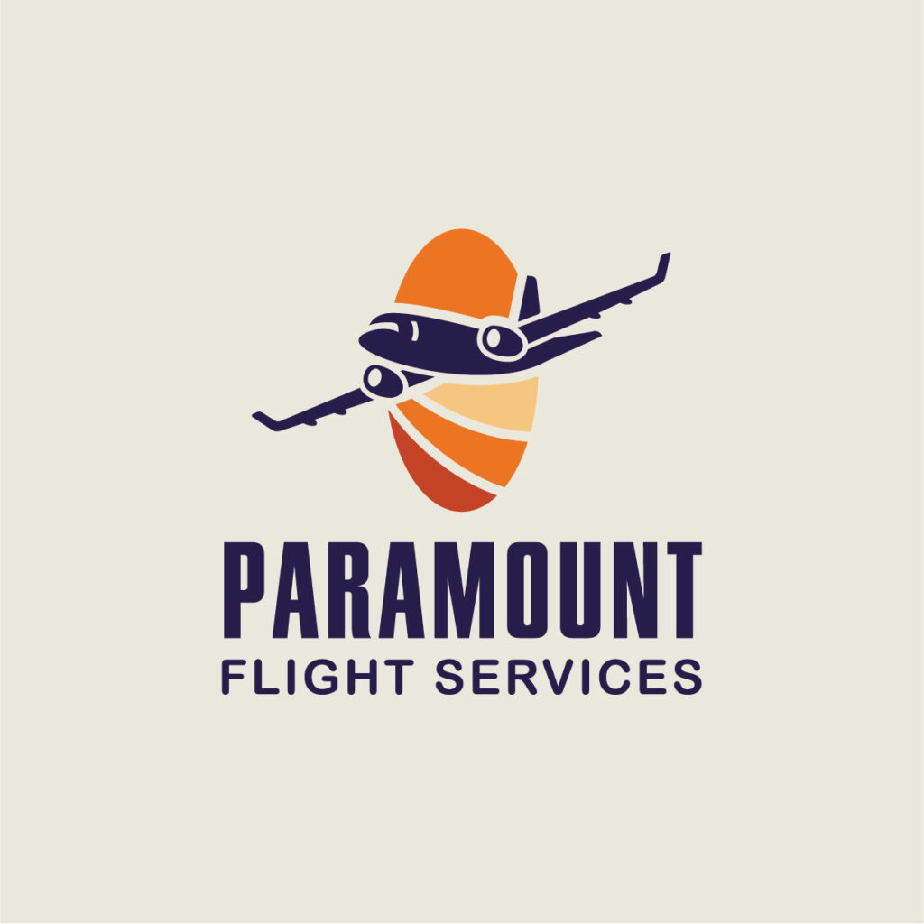
At the heart of our design for Paramount Flight Services lies a thoughtfully crafted logo that encapsulates the brand’s essence. The logo integrates two key symbolic elements: the airplane in motion and horizon elements within a globe-shaped design. This harmonious combination creates a cohesive representation of Paramount Flight Services as a globally-focused aviation company.
Icon Design
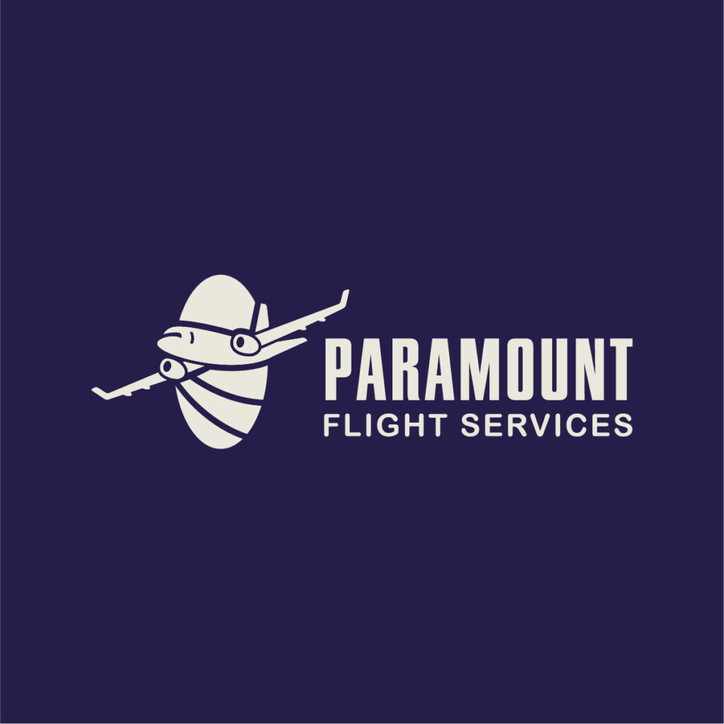
The icon features an oval-shaped element that symbolizes both the horizon and the globe, connecting these elements to the overarching umbrella logo for strong brand recognition. The airplane, depicted flying upward and to the right, conveys a sense of forward movement, progress, and the ambition to reach new heights. This dynamic representation not only captures the essence of air travel but also signifies the brand’s commitment to growth and excellence.

Color Choice
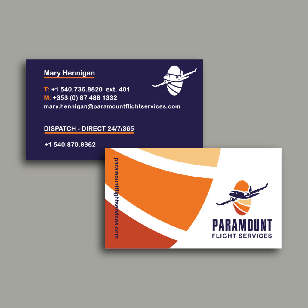
In an industry often saturated with blue tones, we wanted Paramount Flight Services to stand out. We chose deep purple and vibrant orange as the brand’s primary colors. Deep purple embodies luxury, prestige, and innovation—qualities that resonate with the company’s mission. In contrast, orange radiates energy and enthusiasm while enhancing visibility. The striking combination of these colors creates a balanced contrast that signals the brand’s unique and bold positioning in the market.
Font Choice
To maintain a cohesive look with the main company logo, we opted for a font selection that ties back to the brand’s identity. The word “Paramount” is displayed in a large, bold font, ensuring it captures attention as the first element visible in the brand. “Flight Services” is presented in a lighter font weight, signifying the specialization of the company while maintaining a relationship with the primary name. This thoughtful typography reinforces brand recognition and professionalism.
Comprehensive Marketing Materials
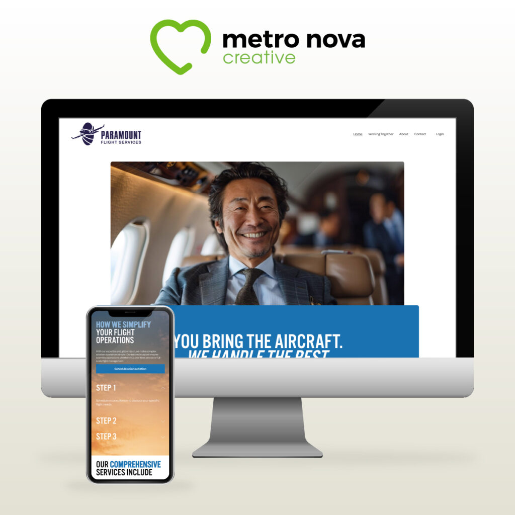
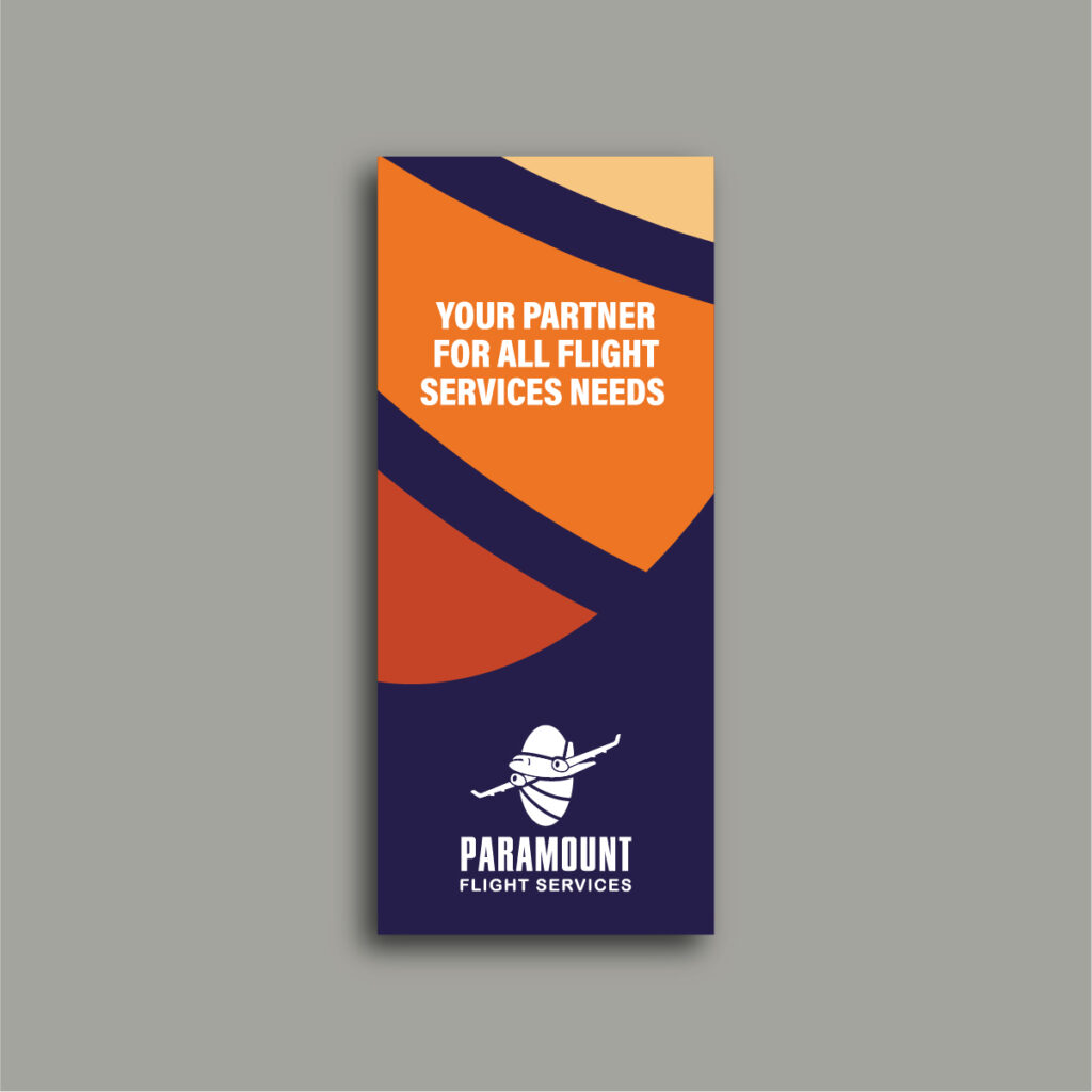
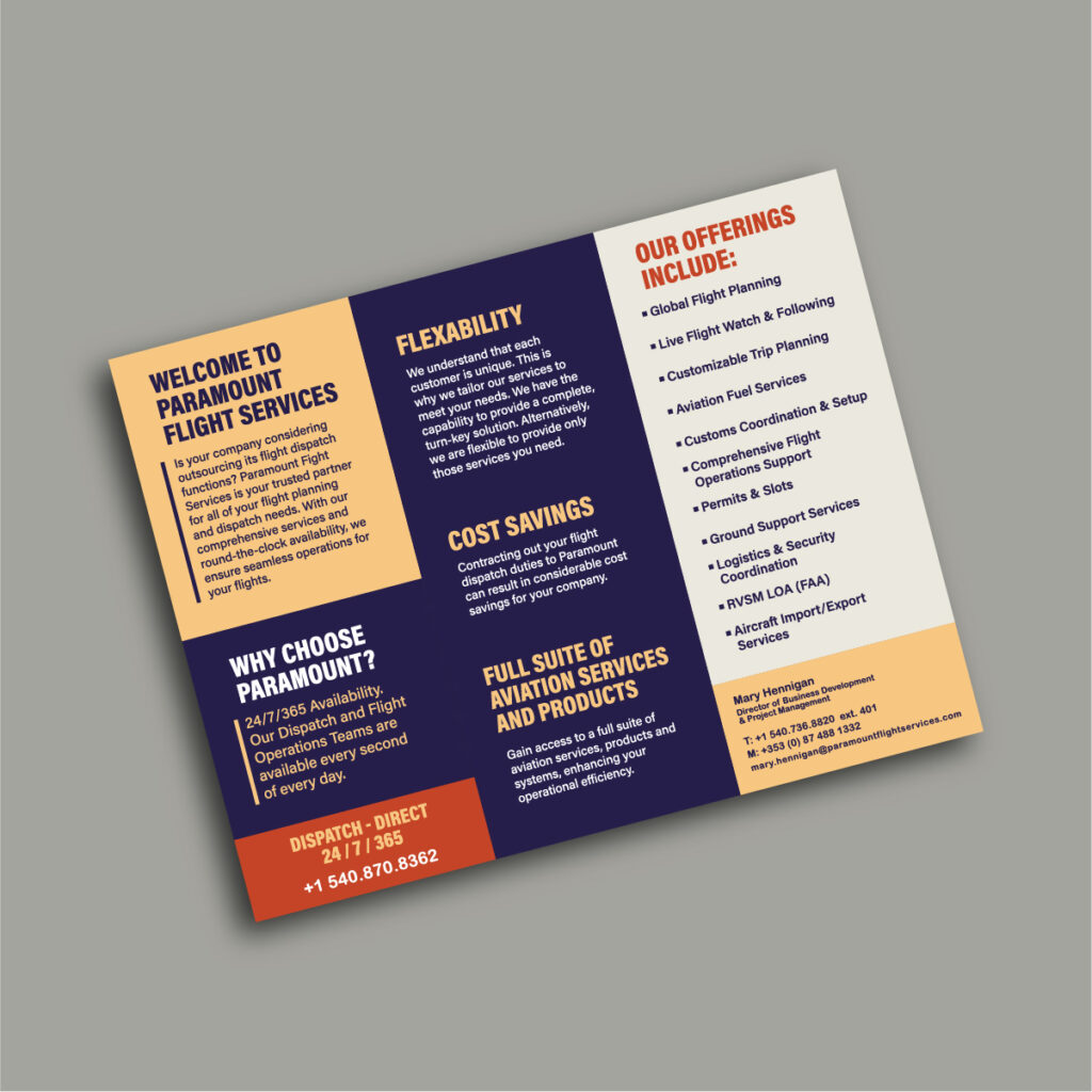
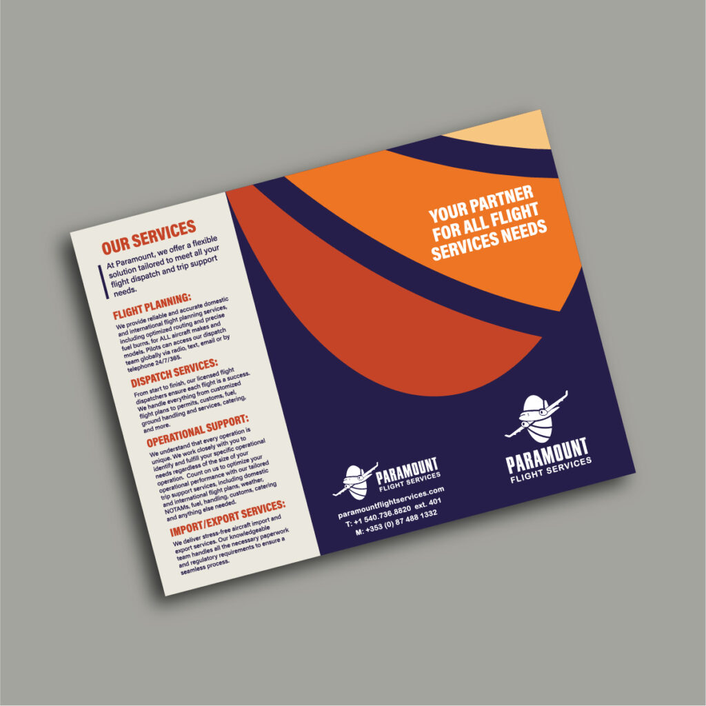
In addition to the logo, we developed a suite of marketing materials to ensure a consistent brand message across all platforms. This included a user-friendly website that showcases Paramount Flight Services’ offerings and values, a trifold brochure that provides an overview of their services, and sleek business cards that convey professionalism. We also designed web banners and additional promotional materials, all reflecting the cohesive brand identity we established.
In Conclusion
At Metro Nova Creative, we believe that a strong brand identity is pivotal for success, especially in a competitive field like aviation. Our collaboration with Paramount Flight Services allowed us to merge creativity with strategy, resulting in a brand identity that not only stands out but also aligns with their vision for the future. We’re excited to see how this new identity propels them to new heights!


