Keep Your Logo Simple: A Lesson in Real-World Branding
If you’ve been anywhere near branding conversations lately, you’ve probably seen a flood of AI-generated logos. Some of them look fun. Some look impressive. And a lot of them make great graphics.
But here’s the thing: a great graphic does not automatically make a great logo.
At Metro Nova Creative, one of the biggest lessons we teach business owners is this: your logo has to work in the real world, not just on a screen.
A Logo’s Job Is Recognition, Not Explanation
One of the most common mistakes we see is business owners trying to make their logo explain everything they do.
For example:
- Dog park
- Beer
- Hot dogs
- Community space
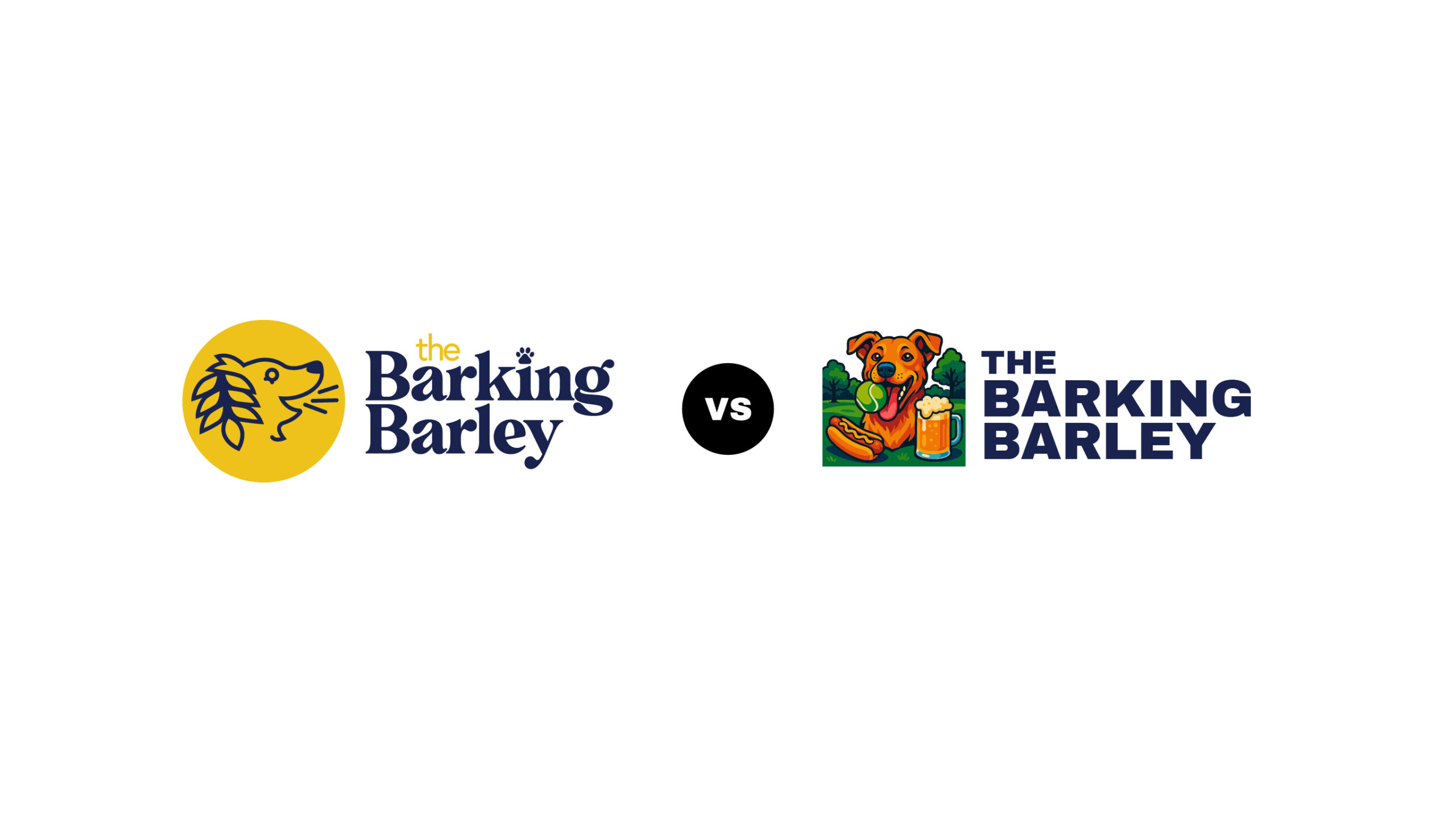
It’s tempting to cram all of that into one image. AI logos are especially guilty of this — they tend to stack objects, text, and ideas into one busy graphic.
But your logo doesn’t need to explain your business.
It needs to be recognizable and memorable.
Your website, signage, copy, and customer experience do the explaining.
Why Simple Logos Scale Better
Let’s talk about scale — because this is where many logos fall apart.
A logo needs to work:
- On a billboard
- On social media
- On a website header
- On a sticker
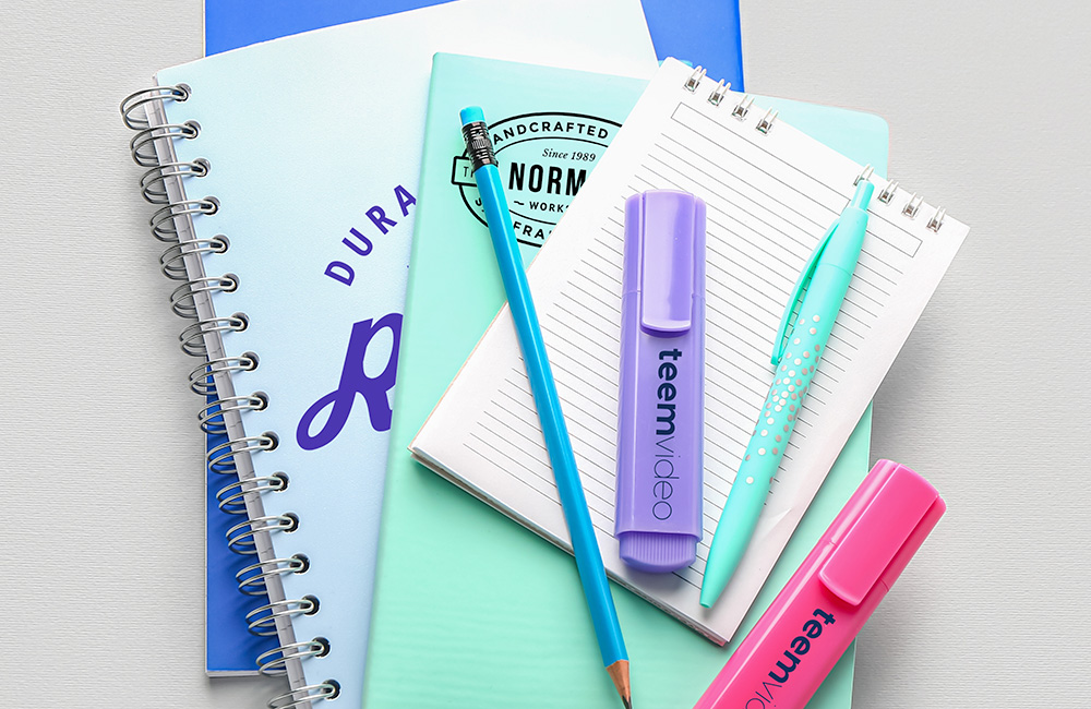
- On the side of a pen
When a logo is too detailed, it quickly becomes unreadable at small sizes. In your video, you can clearly see how a complex AI-generated logo loses all clarity when scaled down, while a clean, simple icon stays recognizable VEED.
If someone can’t recognize your logo at a glance, it’s not doing its job.
One Color Matters More Than You Think
Another real-world test we use is the one-color rule.
Can your logo:
- Be embroidered?
- Be printed cheaply?
- Work in black and white?
Many AI logos completely fail here. Once you strip away color and shading, there’s nothing left to recognize. A strong logo, on the other hand, still works in a single color whether it’s on merch, signage, or promotional items.
The Barking Barley: A Simple Logo Done Right
In the video, you shared an example from The Barking Barley, where a clean, simple icon does the heavy lifting:
- Strong contrast
- Clear shape
- Recognizable even at small sizes
- Paired with a wordmark that fits the brand
It doesn’t list everything the business does.
It doesn’t rely on trendy effects.
It simply works, everywhere it needs to.
Simple Doesn’t Mean Boring
This is the part people get wrong.
Simple logos aren’t boring.
They’re intentional.
They’re designed to:
- Last longer
- Be easier to reproduce
- Build recognition over time
The brands you recognize instantly didn’t get there by being complicated, they got there by being consistent.
Final Thought
AI tools can be great for inspiration. They can even create fun graphics or sticker designs.
But when it comes to your logo, the foundation of your brand simplicity, clarity, and real-world usability will always win.
If you’re thinking about creating or refining a logo for your business, make sure it’s built to work everywhere your brand shows up.


