Three Generations, One Signature: Rebranding Matern Staffing
Client: Matern Staffing — Fredericksburg, VA Services: Brand consultation, logo design, brand identity system, pitch decks, print collateral.
This Fredericksburg business rebranding project was not about starting over. It was about looking back.
Matern Staffing is a third-generation, woman-owned staffing agency that has been connecting employers and job seekers across Virginia, Maryland, and the greater MidAtlantic for more than 55 years. They’re an established name here. So when they came to us about their identity, the goal was never to blow it up. It was to make the brand look like the company actually feels.
The Client
Matern places people in warehouse roles, skilled trades, administrative and accounting positions, IT, and executive search. Their candidates are working people, and their clients are the businesses that depend on them. It’s a practical business built on relationships.
The history behind it runs deep. Ann Duffer opened Ann Duffer Personnel in 1967, placing people in clerical and professional roles. Her daughter, Cindy Duffer Matern, carried the business forward through the next generation. After Cindy passed in 2015, her children stepped in, and Ginni Matern launched Matern Staffing in January 2017, building directly on the foundation her grandmother and mother had laid.
Three generations of women. One continuous thread.
The Challenge
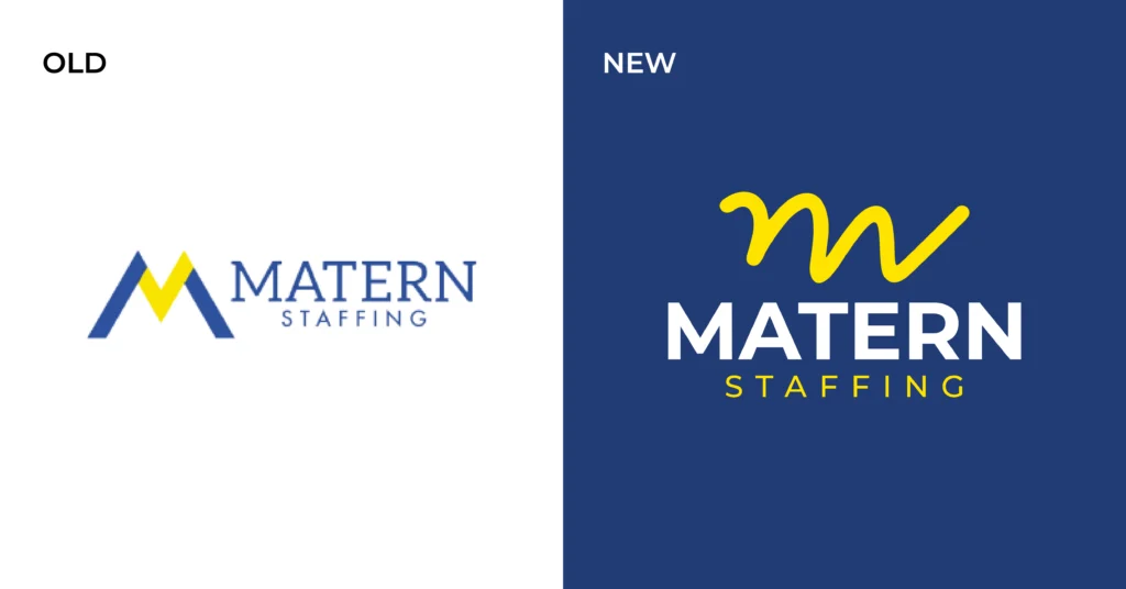
Their existing logo was sharp. Hard edges, tight corners, a lot of angle. It looked capable, but it read colder than the company is. Walk into their office and you get something different: warm, welcoming, genuinely friendly. The culture they’ve built is approachable. Their brand wasn’t saying that. So we had two things to solve at once:
- Soften the visual voice so it matched the real culture, without losing credibility with the employers and job seekers they serve.
- Protect brand equity. After 55+ years and a well-known name in this market, a dramatic overhaul risks confusing the people who already know and trust them. Recognition is an asset. You don’t throw it away. That tension, modernize without erasing, shaped every decision that followed.
Our Approach
We started with a consultation. Before we drew anything, we needed to understand who Matern serves, how those audiences make decisions, and what the family wanted the brand to carry forward.
That conversation surfaced the detail that changed the project: the founder’s handwriting.
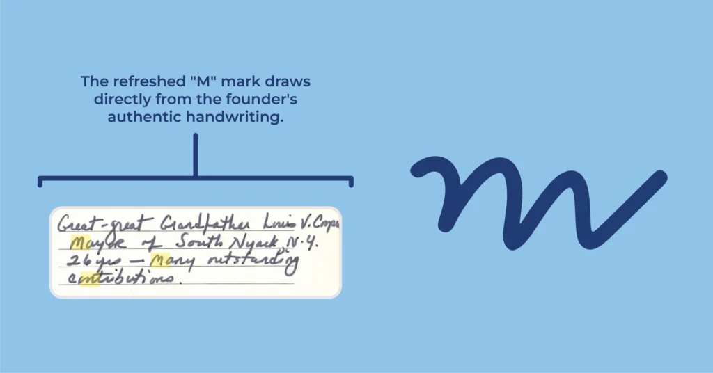
The family still had handwritten letters and notes from Ann. Reading them, the answer was sitting right there. The warmth they wanted the brand to communicate already existed, in her hand, from decades ago.
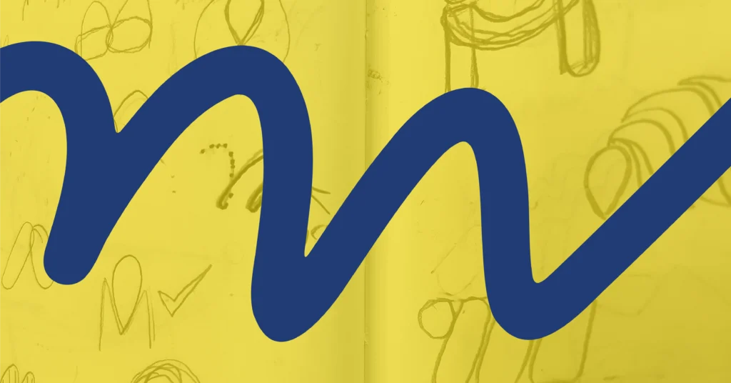
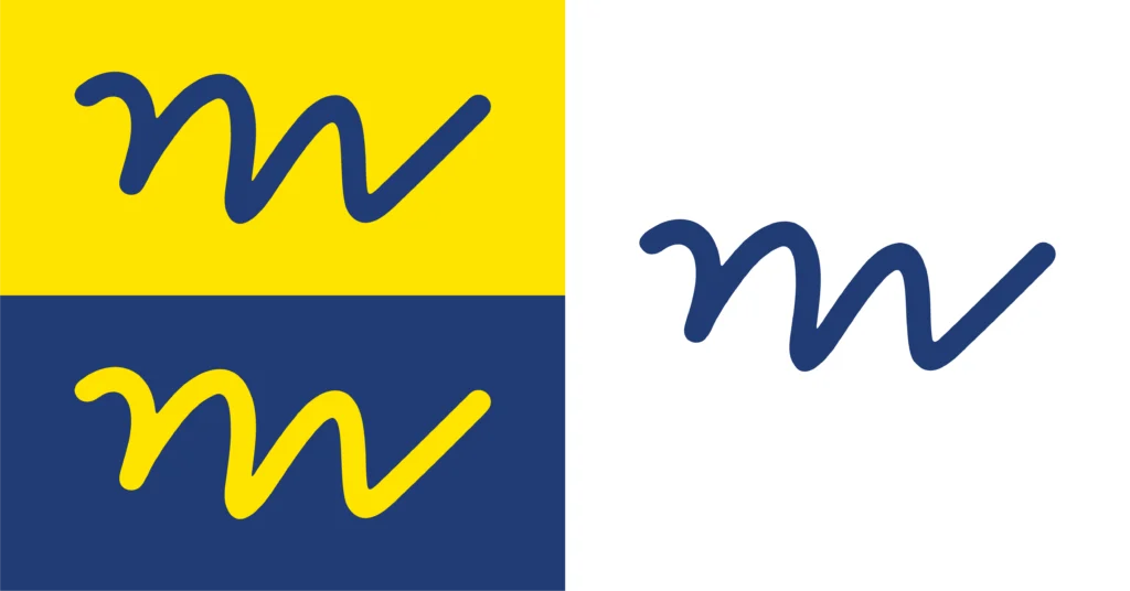
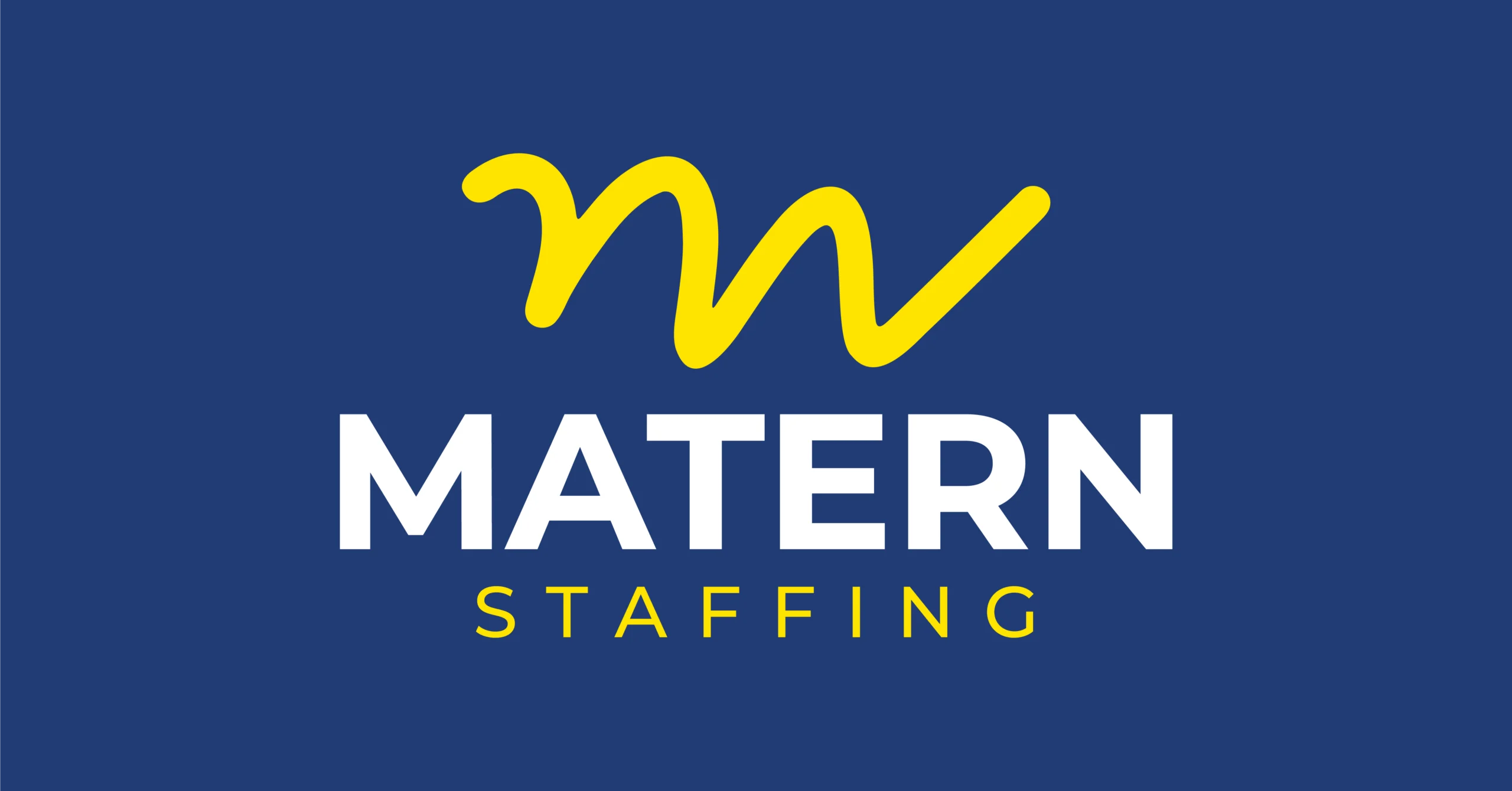
So we traced it. We studied the letterforms, pulled the curves and rhythm out of those notes, and built the new icon from her actual handwriting.
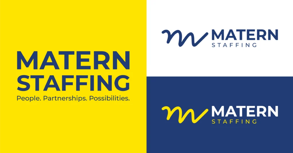
It solved both problems in one move. The hard edges gave way to something organic and human. And the softness wasn’t a trend borrowed from a mood board, it came from the woman who started the company. That’s a mark no competitor can copy, because no one else has it.
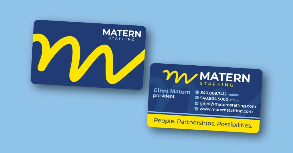
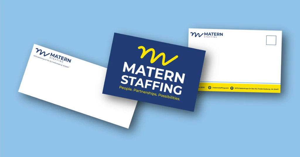
From there we developed multiple logo concepts and presented them in pitch decks that walked the family through the reasoning behind each direction: what it says, who it speaks to, how it holds up across applications. Once the direction was set, we carried the identity into print materials so the brand shows up consistently everywhere Matern meets a client or candidate.
The Result
A brand that looks like the business it belongs to.
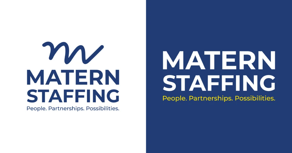
The new identity keeps the elements customers already recognize, so there’s no market confusion. The palette and structure stay familiar. What changed is the feeling: approachable instead of severe, warm instead of clinical. Side by side, the before and after tells the story better than we can.
Matern now has an origin story built into their logo. When someone asks where the mark came from, the answer is a good one.
What This Means for Your Business
If your brand hasn’t kept pace with your company, you don’t necessarily need to scrap it. A few things worth asking:
- Does your identity match your culture? If people describe your business one way and your logo says something else, that gap costs you.
- What equity are you sitting on? Recognition takes years to build. A smart refresh protects it.
- What’s already in your history? The most distinctive brand assets are usually the ones you already own, a founder’s handwriting, an original sign, a piece of the story nobody else has.
Let’s Talk About Your Brand
Whether you’re after a light refresh or a full overhaul, we’d love to hear what you’re working on. Metro Nova Creative handles brand identity, web design, print, promotional products, and social content for businesses across Fredericksburg and the surrounding area.
Schedule a consultation or reach us at 540-369-3200 or [email protected].
Thanks to the Matern family for trusting us with something this personal.