At the heart of every successful business lies a strong brand identity, and we had the exciting opportunity to partner with Pro Service Plumbing & Gas to develop theirs. From the logo to the website, our design process was guided by a deep understanding of the company’s values and target audience. Here’s a closer look at the design journey and the key elements that brought their brand to life.
Who is Pro Service Plumbing & Gas?
Pro Service Plumbing & Gas is a trusted provider of plumbing and gas services, dedicated to delivering reliable and friendly support to the community. With core values rooted in honesty, hard work, and exceptional service, they prioritize customer satisfaction and safety in every project. Their team of licensed professionals is committed to high-quality workmanship, transparent communication, and meticulous attention to detail, treating each home with care. Their mission emphasizes excellence and integrity, ensuring that every job meets the highest standards. When you choose Pro Service Plumbing & Gas, you’re opting for fast, dependable service that truly makes a difference in your home and community.
The Project: Crafting a Cohesive Brand Identity
We had the privilege of partnering with Pro Service Plumbing & Gas to design their logo, brand identity, website, and marketing materials. Our goal was to create an engaging brand that resonates with their target audience and embodies the unique qualities of their business.
Logo Design
The logo we created for Pro Service Plumbing & Gas is semi-traditional yet powerful. Its versatility in color and design allows it to appeal to a broad customer base. The inclusion of flame and water icons signifies their expertise in both plumbing and gas services while also functioning independently for various branding needs.
Badge Design
Our badge design adds an authoritative touch, reinforcing the brand’s reliability. The shield shape symbolizes protection and security, instilling trust in customers.
Icon Design
The standalone icon captures the essence of balance and harmony, further enhancing brand representation across various platforms.

Color Choice
The color palette we selected reflects the brand’s core values and mission. Red symbolizes a proactive approach, while light blue stands for trust and medium blue represents cleanliness. Dark blue conveys expertise, and yellow highlights the company’s customer-centric dependability. Together, these colors embody professional integrity and a commitment to quality, creating a cohesive visual identity that resonates with customers.
Font Choice
We chose the font ‘Erbaum’ for its confident and strong appearance, leaving a lasting impression on anyone who interacts with the brand.
Pattern Design
The flame and water droplet pattern reinforces the company’s core services, strengthening brand recognition and emphasizing their expertise.


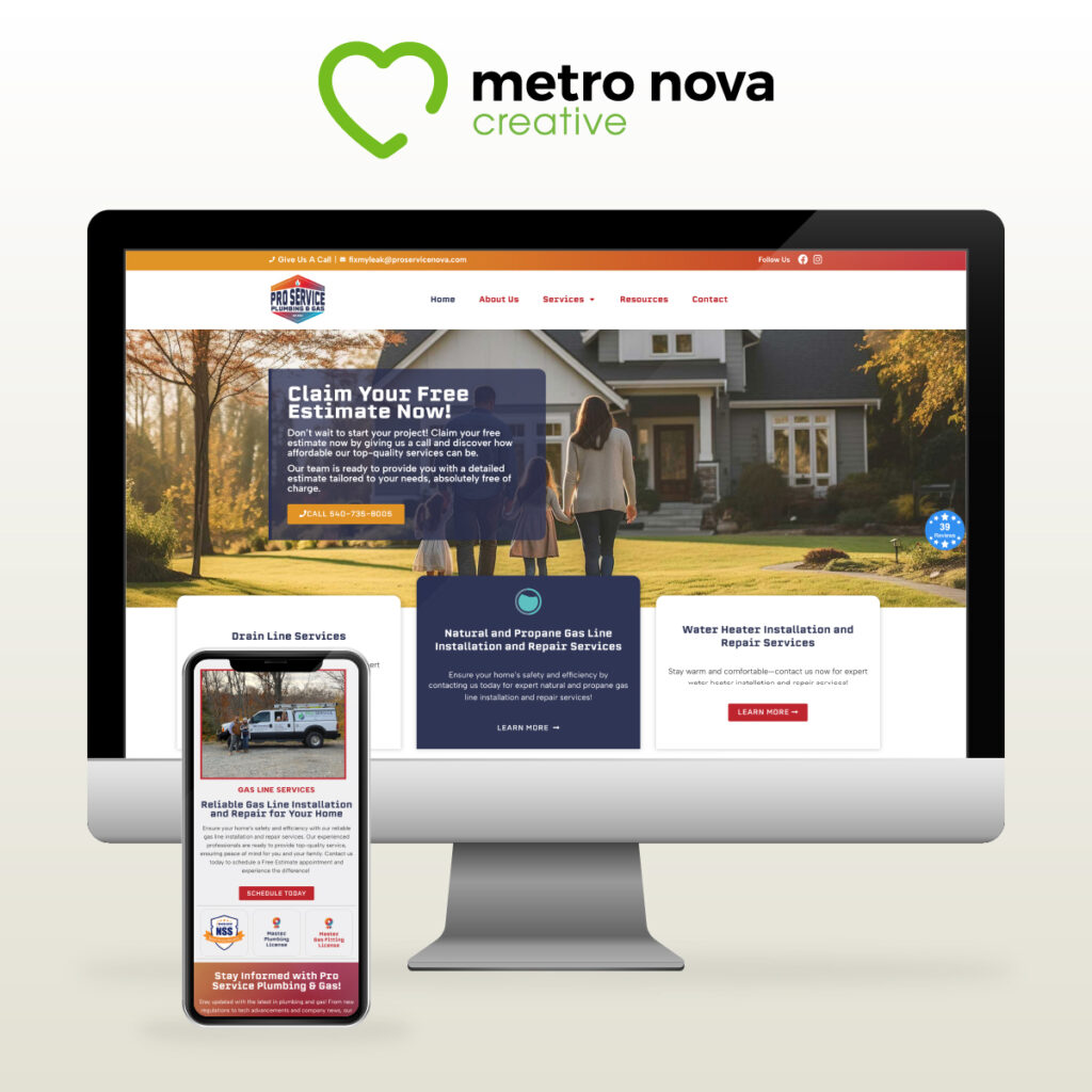
Website Design: A Digital Extension of Excellence
The website design for Pro Service Plumbing & Gas is a crucial element in their branding strategy. We aimed for a user-friendly interface that reflects the same values of professionalism and reliability as their physical services. The website incorporates the brand’s color palette, logo, and typography to ensure a seamless experience. Engaging content, including informative blog posts and service descriptions, helps educate customers while reinforcing the brand’s commitment to transparency and expertise. Additionally, easy-to-use contact forms facilitate quick inquiries and service requests, streamlining communication with potential customers.
By creating a website that is not only visually appealing but also functional, we ensured that Pro Service Plumbing & Gas has a digital presence that reflects their dedication to quality and service.
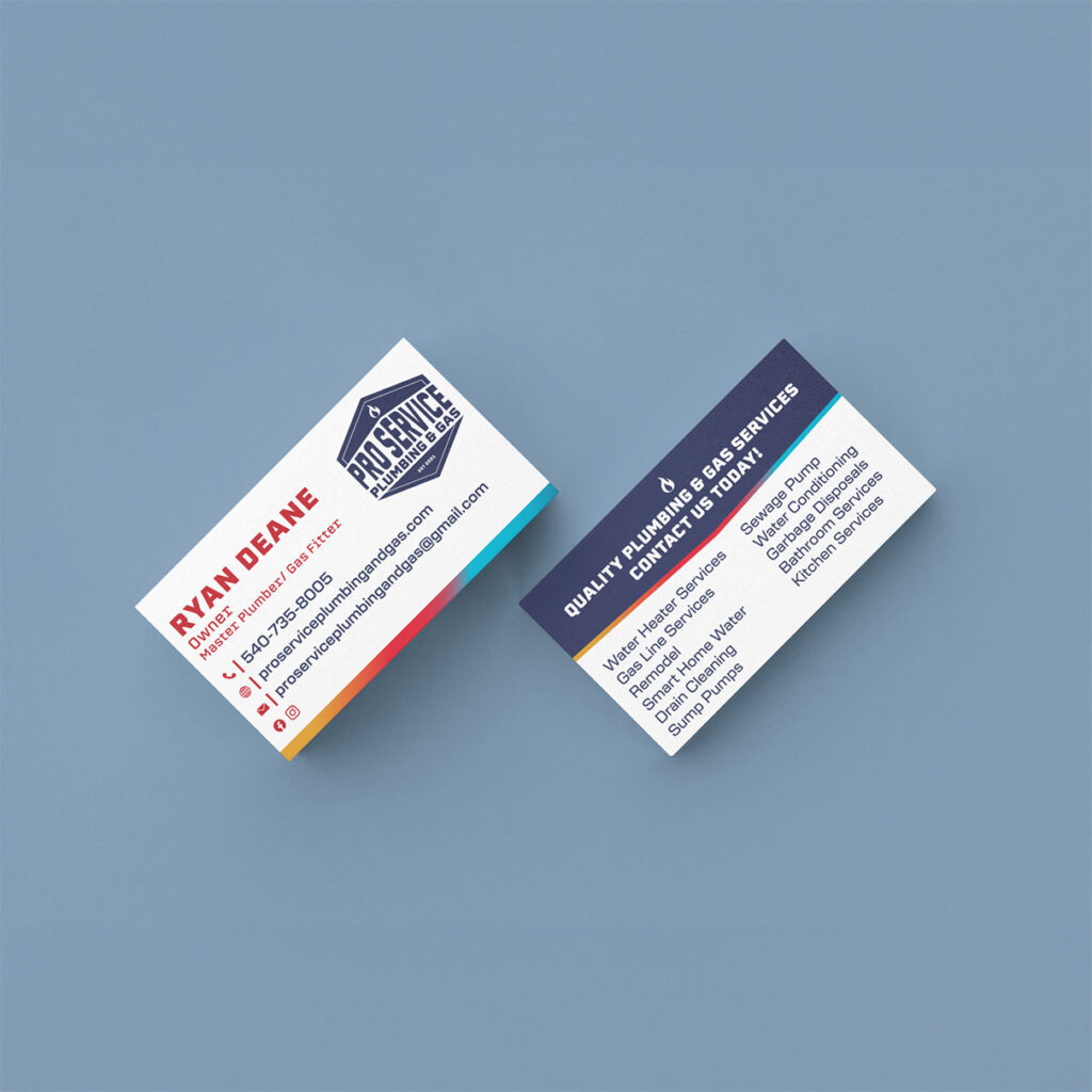
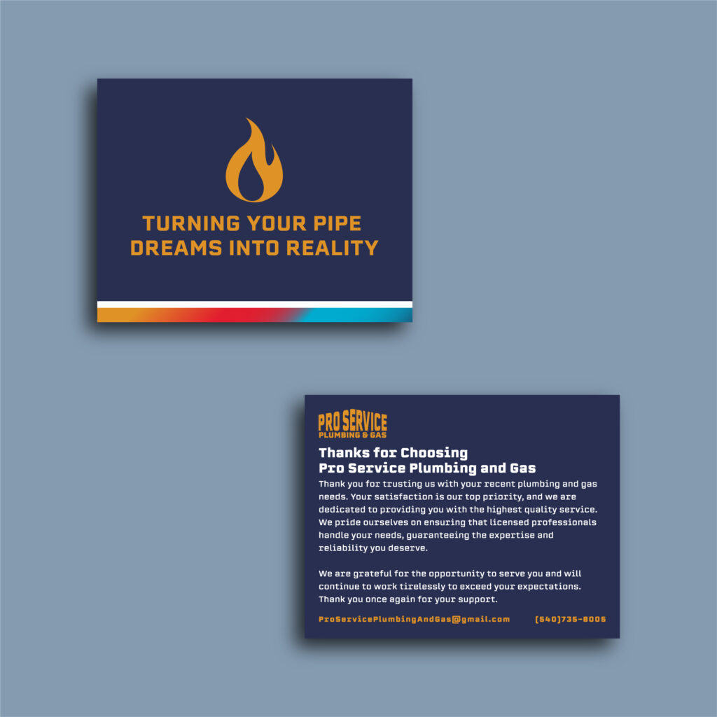
Marketing Materials: Bringing the Brand to Life
In addition to the logo and website, we had the pleasure of designing various marketing materials, including business cards, magnets, t-shirts, and even a car wrap. Each piece was crafted to ensure brand consistency and recognition in the community.
In Conclusion
The design process for Pro Service Plumbing & Gas was a collaborative and creative journey focused on building a cohesive brand identity. By carefully considering each element—from the logo and color palette to the website and marketing materials—we created a brand that truly reflects their commitment to excellence and service. The end result is a recognizable and reliable brand that resonates with their target audience and sets them apart in the plumbing and gas industry.