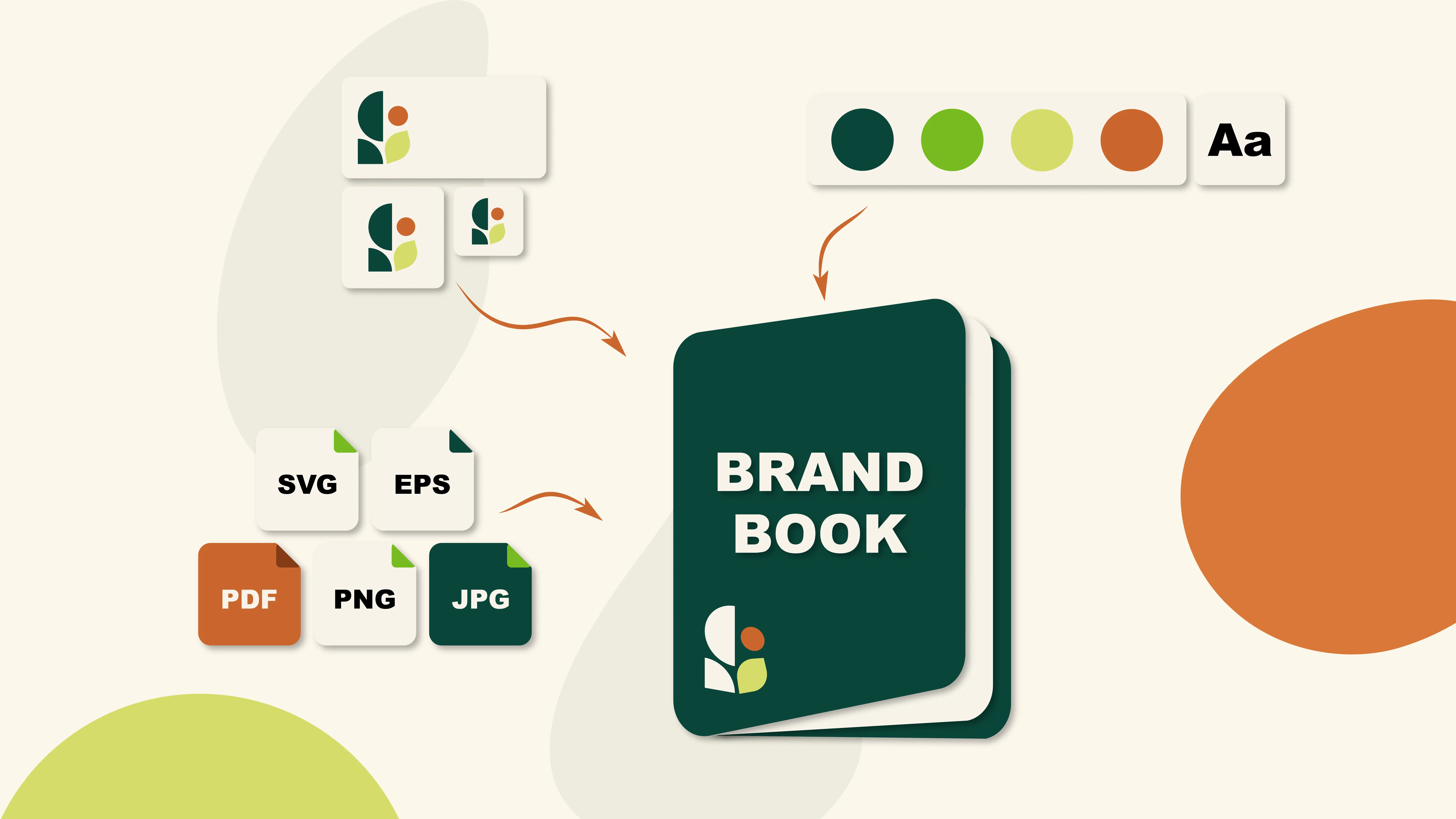
What do you get when you buy a logo? Or, put the way we asked it on video: what should you actually get?
Not a picture. A system.
A logo is one drawing, but your business is going to use it in a hundred places: a truck door, a hat, a website header, a trade show banner, a rack card, an email signature, an Instagram profile photo the size of a dime. One file can’t do all of that. A complete logo package hands you every version and every format you’ll need before you need it, plus a document that tells any vendor exactly how to use them.
Here’s what that looks like, piece by piece.
What you get when you buy a logo: the complete list
This is what ships with a Metro Nova Creative logo package. It’s also a handy reference if you ever want to see how a folder you already have stacks up.
Logo variations
- Horizontal (primary) lockup
- Stacked or vertical lockup
- Icon or submark on its own
- Wordmark on its own
- Full-color version
- One-color / black version
- Reversed / white version for dark backgrounds
File formats
- SVG (web and scalable)
- EPS (print, embroidery, sign shops)
- PDF (vector, universal)
- PNG with a transparent background
- JPEG for anything that needs a white background
Color modes
- CMYK versions for print
- RGB versions for screens
- HEX codes documented
- Pantone (spot) colors when you print or produce apparel
Documentation
- A brand guidelines document (PDF)
- Font names and weights listed
- Clear space and minimum size rules
- Written confirmation that the artwork is yours
1. The variations: one logo, several shapes
A horizontal logo won’t fit in a square profile photo. A stacked logo looks lost on a banner that’s ten feet wide and two feet tall. A detailed full-color mark disappears when it’s embroidered on a beanie.
That’s why a package includes lockups, not a lockup:
- Horizontal for website headers, letterhead, and email signatures.
- Stacked for square spaces, apparel, signage, and social profiles.
- Icon for app icons, favicons, sleeve prints, hang tags, and anywhere the full name won’t read.
- Wordmark for tight horizontal spaces and co-branded layouts.
- One-color and reversed for engraving, embroidery, vinyl, invoices, newspaper ads, and every dark background you’ll ever design on.
Every one of these gets used within the first year. Ask any business owner who has tried to shrink a full-color logo into a pen imprint.
2. The formats: vector versus raster
This is the part that costs people money, so it’s worth two minutes.
Vector files (SVG, EPS, PDF, AI) are built from math, not pixels. Scale them to a business card or a billboard and they stay perfectly sharp. Vector is the master. It’s what a sign shop, a screen printer, an embroiderer, or a vehicle wrap installer will ask for the moment you place an order.
Raster files (PNG, JPEG) are built from pixels at a fixed size. They’re smaller, faster, and perfect for web use — your website, your social profiles, your email signature, your slide deck. Push one past its size and it turns into mush.
| Format | Type | Use it for |
|---|---|---|
| SVG | Vector | Websites, crisp at any screen size, tiny file |
| EPS | Vector | Print vendors, embroidery, screen printing, signage |
| Vector | Sending to anyone, proofing, print-ready art | |
| PNG | Raster | Web and digital where you need a transparent background |
| JPEG | Raster | Documents, slide decks, anywhere a white box is fine |
The short version: PNG and JPEG for screens. SVG, EPS, and PDF for anything that gets made. Without vector files, producing a sign, a shirt, or a wrap starts with paying someone to redraw your logo first.
3. The color modes: CMYK, RGB, and why printed pieces come back wrong
CMYK is ink. RGB is light. They’re two different color systems, and they don’t overlap perfectly.
That vivid electric blue on your website is made of glowing pixels. Ink can’t glow. When an RGB file gets sent to a press without conversion, the software converts it on the fly and you get a duller, muddier version than the one you approved on screen. That’s the phone call every printer has had a thousand times.
A complete package solves it before it happens: CMYK files for print, RGB files for screens, HEX codes for developers, and Pantone numbers when color consistency across materials matters. Those codes come written down in plain text, too, so nobody ever has to eyedropper a color out of an old file.
4. The brand guidelines document — the piece that saves you the most money
This is the deliverable people skip, and it’s the one with the highest return.
A brand guide is a PDF that documents the rules of your brand:
- Which logo version to use, and when. Horizontal here, stacked there, icon only at these sizes.
- Clear space. The minimum breathing room required around your logo, usually measured against an element of the mark itself. It’s what keeps your logo from being crammed against a headline or a page edge.
- Minimum size. The smallest your logo can be printed or displayed before it stops reading.
- Color codes. CMYK, RGB, HEX, and Pantone for every brand color, primary and secondary.
- Typography. Font names, weights, and where each is used — headlines, body copy, accents.
- What not to do. No stretching, no recoloring, no drop shadows, no rotating it, no setting it on a busy photo.

Why this document pays for itself
You’ll hire more vendors than you expect. A printer. A sign company. A promotional products rep. A web developer. A trade show booth builder. An embroiderer. A social media contractor. Someone’s nephew making a flyer for a charity golf tournament.
Every one of them asks the same three questions: What file do you have? What are your exact colors? What font is that?
Without a brand guide, those questions get answered from memory, eight separate times, a little differently each time. Each wrong answer has a price tag on it:
- Art and setup fees to recreate or clean up logo files a vendor can’t use.
- Reprints because the blue on the rack cards doesn’t match the blue on the banner.
- Embroidery digitizing done twice because the first shop guessed at thread colors.
- Design hours billed while a freelancer hunts for your fonts.
- Slow, quiet brand drift — six versions of your logo in the wild, none of them quite right, all of them yours.
With a brand guide, you attach one PDF to the first email. The vendor has everything. The work comes back matching. That’s the whole mechanism, and it repeats with every vendor you hire for as long as you’re in business.
A note on fonts: we give you the font names and weights, not the font files. Type foundries license fonts to specific users, and passing along the actual files isn’t ours to do. The guide tells you and your vendors exactly which fonts to license and where to get them.
5. What else can come with a brand package
Depending on scope, a brand system can go well past the logo. Common additions:
- Brand patterns and textures for packaging, backgrounds, apparel, and interior graphics
- Custom icon sets drawn to match the logo, for websites, decks, and service pages
- Brand mascots and character illustrations
- Marketing materials — business cards, rack cards, flyers, signage, vehicle graphics, trade show displays
- Apparel and promotional product designs
- A website built on the identity instead of bolted onto it
- Social media templates and profile assets
What’s right for you depends on the brand and the scope of the project. A tree service and a taproom need very different things on day one.
If your current logo is missing some of this
Plenty of businesses come to us with a logo they like and a folder that’s thinner than it should be. That’s a common, fixable situation, and it doesn’t mean starting over.
- Ask your original designer for the source and vector files. Ask in writing. It’s also worth confirming in writing who owns the artwork and whether ownership was transferred to you.
- Have your existing logo redrawn as true vector art. If the design works and the files just aren’t usable, this is the fix. It’s rebuilding, not redesigning.
- Add a brand guide to the logo you already have. You don’t need a new identity to get the document that makes every future vendor cheaper.
- Rebrand on purpose. Sometimes the review turns up a logo that isn’t holding up anymore. That’s useful information, not bad news.
Frequently Asked Questions
Q: What file formats should a logo come with? A: A complete logo package includes vector files (SVG, EPS, PDF) for print, signage, embroidery, and anything that gets physically produced, plus raster files (PNG, JPEG) for websites, social media, and digital use. Vector files scale to any size without losing quality. Raster files don’t.
Q: What’s the difference between vector and raster logo files? A: Vector files are built from mathematical paths, so they stay sharp at any size, from a business card to a billboard. Raster files are built from pixels at a fixed size and get blurry when enlarged. Vendors who produce physical items almost always need vector.
Q: Do I need a brand guidelines document? A: Yes, if you plan to hire more than one vendor. A brand guide documents your logo versions, color codes, fonts, clear space, and usage rules in one PDF. Sending it to a printer, sign shop, or developer up front prevents art fees, reprints, and mismatched colors.
The bottom line
A logo isn’t a file. It’s a kit and a rulebook. When the package is complete, the next vendor you hire spends their time doing the work instead of asking questions nobody can answer.
Want to know where yours stands? Send us your logo folder and we’ll tell you what’s in it, what’s missing, and what it would take to make it complete.